So you’re thinking about launching an online business. You’ve seen others do it and you’re wondering about what you need to do to make your store a success.
Well we’ve compiled these five key eCommerce fundamentals on what makes a good online store a great one. Let’s get started!
1. Keep things simple.

Complexity hurts conversions. Use straightforward language when describing your key categories. Hollister for example used to use “dudes” and “bettys” as their main navigation labels. This has been since changed to guys and girls.
The navigation labels on Hollister now are limited to just guys, girls, jeans and clearance. It’s key that they are one or at most two word labels with no ambiguity about where they lead to. These open up on hover to reveal subcategories but by containing them within important top level labels it lends to a much cleaner, easier to navigate site.
2. Use great product descriptions.
We’ve already written about how important good product descriptions are to a store’s success but it’s a point worth reiterating.
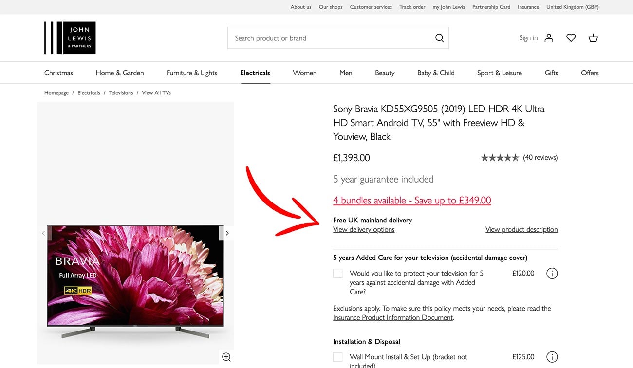
The UK retailer, John Lewis does this particularly well, breaking up the technical descriptions of items such as the TV below into bite sized, descriptive morsels; Vivid display, Football mode etc. It allows for easy scanning of the page to pick out the key features.
Further down there are more technical details including delivery and returns information so you never have to leave that page. Clicking on the link scrolls down to the Delivery section further down on the same page.
3. Make it fast. Really fast.
Update: We poured all our experience of creating really fast eCommerce sites into making the fastest WooCommerce theme, Shoptimizer.
We’ve talked before about optimizing images in WooCommerce to improve sales. Speed is incredibly important when selling, even a delay of a few seconds can cause customers to lose patience and abandon the process.
In addition, Google has in recent years put more and more value on fast loading websites so there are massive implications for your SEO rankings.
Some wonderful research from KissMetrics has highlighted the value of a speedy site to improve conversions.
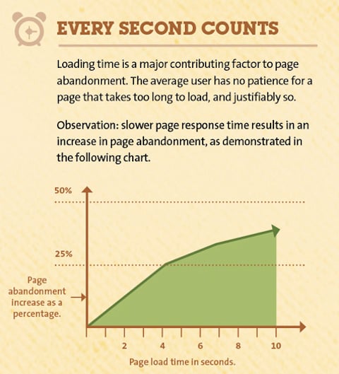
We’ve written up an extensive guide on How to speed up WooCommerce and have a free eBook on the best WooCommerce hosting plans.
4. Work on your Search.
An oft forgotten area of the online shopping experience is that of search. A fast, precise and forgiving search tool can lead to increased conversions and happier customers.
It would be very useful to take a close look at your traffic logs and study the search terms people are entering. Are they misspelling a common item? Is the search smart enough to redirect them to the right place?
With this in mind, you can create and refine an auto-suggest system. Perhaps you need more obvious tags and the categorization of your items could be reviewed.
It’s always a good idea to look at the big players in this area. Ebay’s search is as expected, excellent.
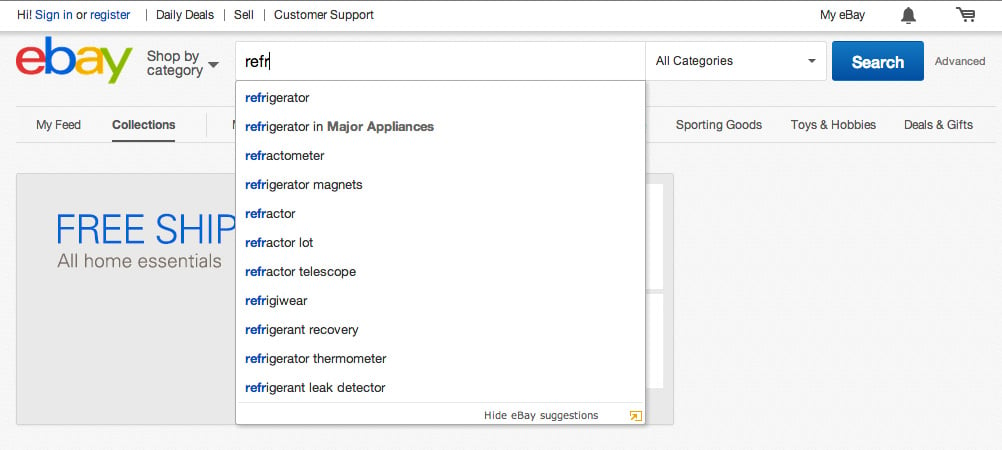
It helps a user spell any awkward words and you can click on suggested link before you have finished typing (I’m curious already what refrigiwear could entail).
By keeping a close look at your search logs you can garner an insight into what your customers are looking for and perhaps cannot find. A search for a cronut on a bakery website would surely have elicited no results up to very recently but might have hinted at potential demand.
5. Test and test again
A little secret that the big players use is a system called A/B Testing – this allows a store to present say two different options to each half of their visitors.
Would an orange button convert better than a green one? Would a left sidebar be more obvious to the user than a right one? We can hypothenise on which might be better from a design standpoint but by installing some basic A/B we can quickly find out and discover the metrics.
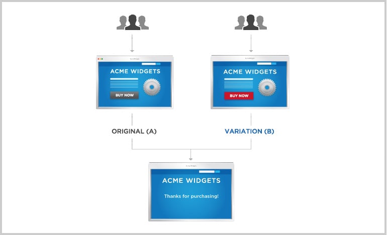
A/B Testing is a very valuable tool for store owners to improve conversions. The advantages are enormous and we’ll delve deeper into this area in future posts.




 FlyingPress Review – An Easy Way to Improve Site Speed
 Advanced Product Fields for WooCommerce Review – Add Custom Fields to Products
 10 Proven Strategies to Boost eCommerce Conversions and Drive Sales
 Problems with eCommerce design: the lack of product information