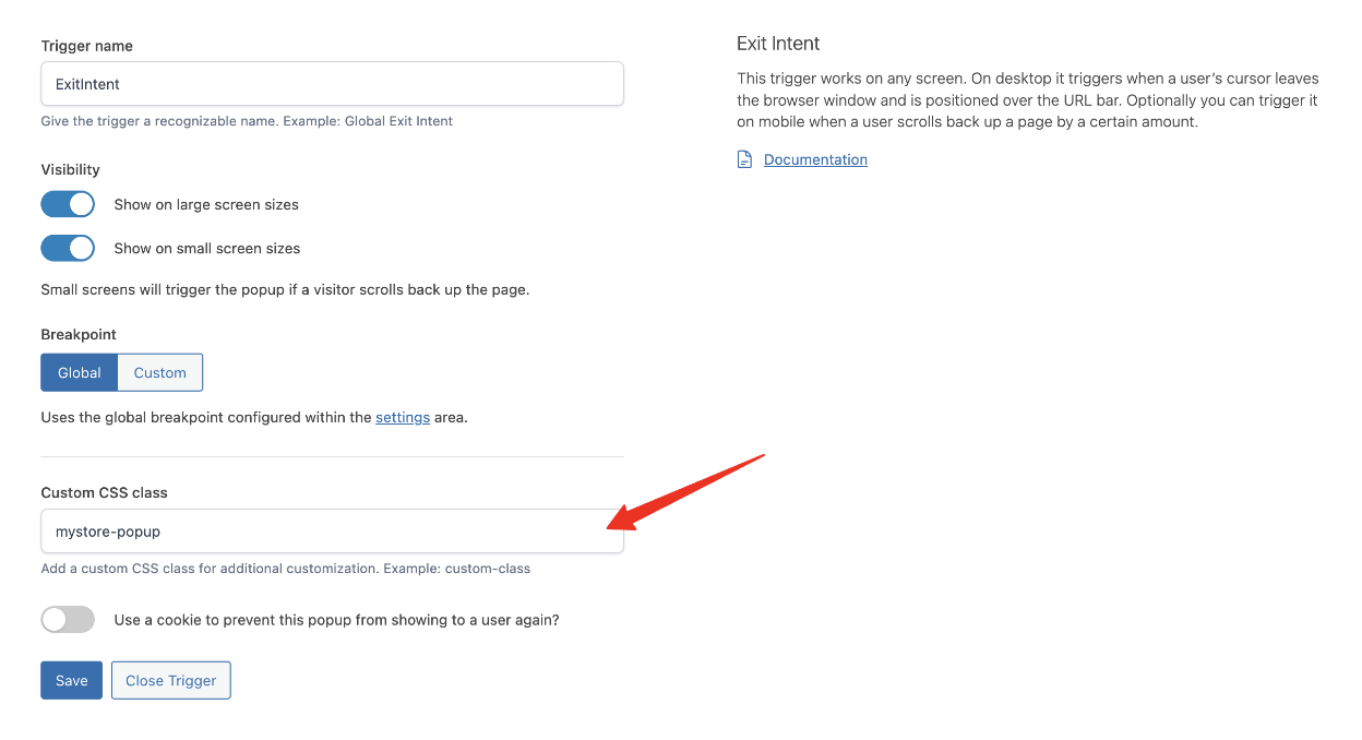
You can adjust the style of a particular popup with custom CSS if you wish. Within the Triggers tab you can enter a class within the Custom CSS class input field.
When entering a custom CSS class, ensure that you do not include the dot prefix.
For example, you could include a class called mystore-popup and use this to change the styling of a particular popup. The examples below target this particular class name, but you can change it to anything you like.
To remove the rounded corners from the popup
This CSS snippet will change the corners to be square, removing the default border radius which gives the popup rounded corners.
|
1 2 3 4 |
dialog.mystore-popup, dialog.mystore-popup .cgpopup-modal--container { border-radius: 0px; } |
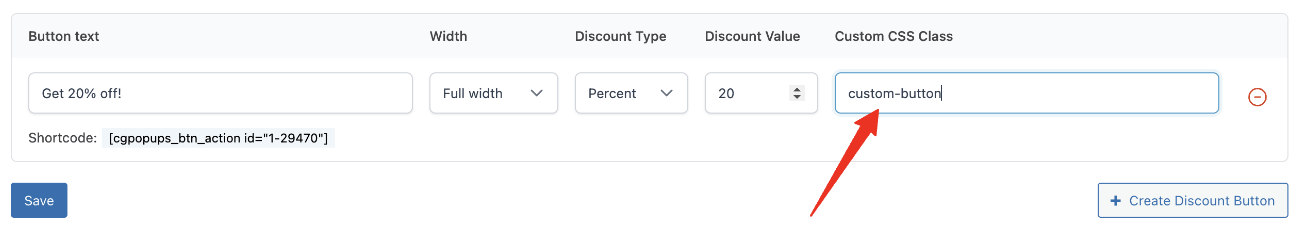
Adding Custom Button Classes
You can also include a custom CSS class to the primary buttons within the popup, i.e. the discount button and the close button.
To increase the button font size
|
1 2 3 |
.custom-button { font-size: 20px; } |
Where to include Custom CSS?
Custom CSS code can be added to the styles.css file of a child theme, or within:
Appearance > Customize > Additional CSS