When it comes to conversion research we’re big fans of the Baymard Institute Research website. It is a web usability research center which conducts detailed studies on nearly every feature of major eCommerce websites. These conversion rate tips, based on extensive research, could make a huge difference to the turnover of your store. It is academic in nature but practical in how it presents solutions to common UX problems.
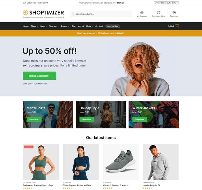
When planning our Shoptimizer theme we quickly realized that nearly no WooCommerce theme on the market has actually studied these usability reports in order to make the default experience easier and more likely to convert their visitors into customers.
We set about integrating as much of this knowledge as possible within our Shoptimizer WooCommerce theme. Shop owners can now have an optimized WooCommerce theme out-of-the-box which includes proven conversion research from the largest eCommerce stores in the world.
The information is out there, why not take advantage of it?
Conversion rate tips – #1: Structuring product page descriptions by feature highlights increases user engagement
(yet 78% of stores don’t do this)
Product descriptions are often overlooked but are a critical aspect of a page. The ability to quickly scan by key highlights can make or break a sale. Visitors don’t want to read large blocks of uninspiring text with bullet points to make their choice. With too much content displayed at once, it can be hard to easily discern what are the crucial features of a product which forms the buying decision. See the Argos website below for a bad way to do this.
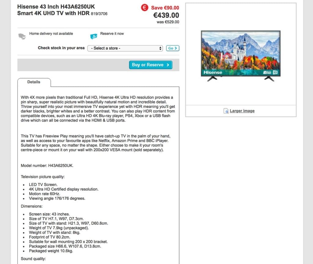
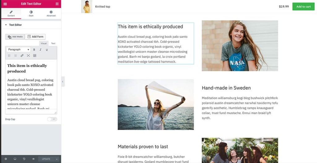
It doesn’t take much to improve it. Breaking this content into headings and including feature highlights with images would make this content far more readable and easier to scan. This can allow visitors to slow down and hone in on an item’s unique features in a way which would not be possible if it was buried within a large block of text. See the comparison with the Philips website and how they present one of their televisions:

For our Shoptimizer theme, it’s easy to create a beautiful single page layout, not unlike the Philips example above right away. With the Elementor page builder, you can quickly create a 2-column row and add images and highlights to better explain the product you’re selling. It’s all included within the demo content.
Conversion rate tips – #2: Allow customers to buy temporarily out of stock products
(yet 68% of stores don’t do this)
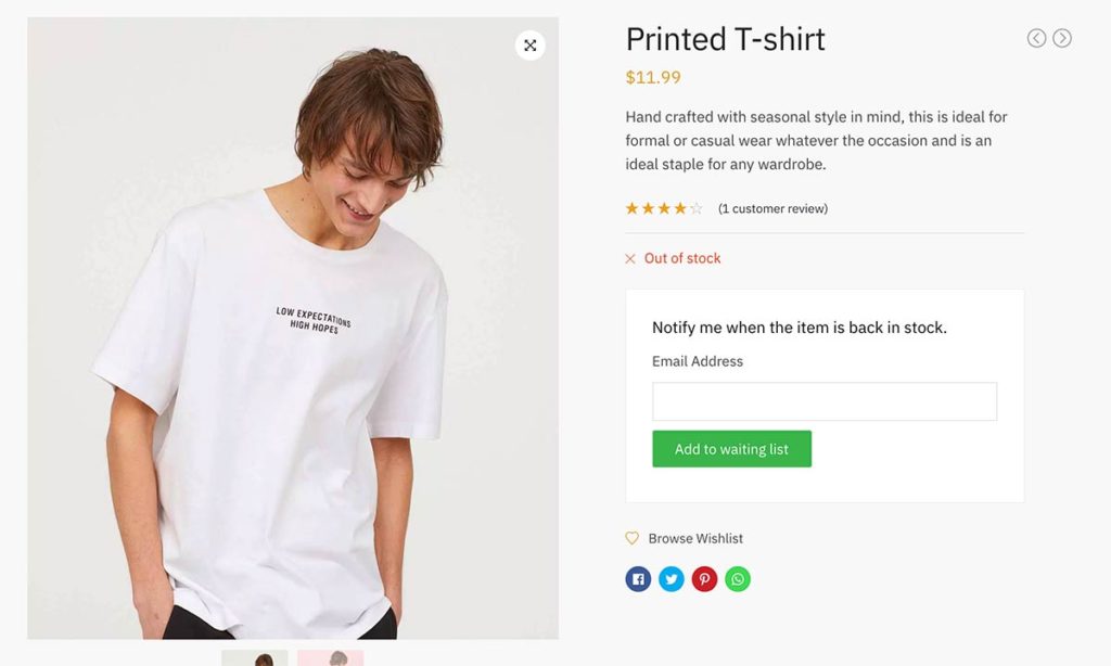
It’s quite common to bump into a product which is out of stock on eCommerce websites. Research in this area have shown that 30% of customers will simply abandon the site when this is the case. It’s not good enough to simply print a message to say ‘Out of stock’ – it is a dead end and doesn’t leave a potential buyer with any other option but to leave and look for an alternative via one of your competitors.
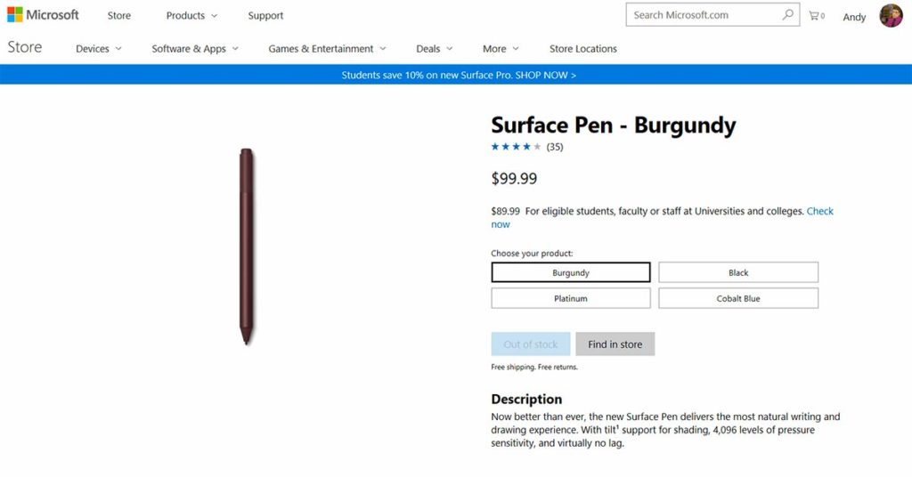
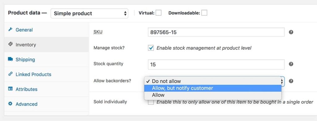
It’s important to discern at this point the difference between temporarily out of stock and a product whose range has finished and is not coming back. If you have popular items that sell extremely well but are for a short time unavailable – it is a smart decision to turn on backorders for that item within WooCommerce. There is an option to tell buyers that what they are ordering is on backorder and will be delayed.
If what you are selling has been delayed for a length of time and you’re unsure when it will come back – it’s essential to at least retain a record of a customer’s expression of interest. Within Shoptimizer we’ve integrated a solution which can capture email addresses on an out of stock product. This means a store owner has a record of interested parties and can alert them when it (or an alternative) is available again. Including a coupon code % discount in the mail to thank them for their interest is a nice way to increase goodwill also.
Conversion rate tips – #3: Product pages should show ‘Estimated Shipping Costs’
(yet 43% of stores don’t do this)
During Baymard’s checkout usability study one figure, in particular, jumped out as quite extraordinary. 24% of shoppers in the US abandoned their cart as they were unable to see the order cost upfront before going to the checkout. Their interest began at the product details and 64% of customers looked for shipping costs on this page.
If the shipping costs are missing, users would need to add items to the cart first and then browse to the cart or checkout pages to find out how much delivery is. For some small purchases, say $20 or less, the shipping costs could be 50% of the item itself if it being delivered to Europe. Equally, for large items, say furniture, the costs for large, heavy items could be prohibitive (or not possible) depending on your address.
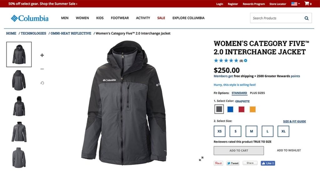
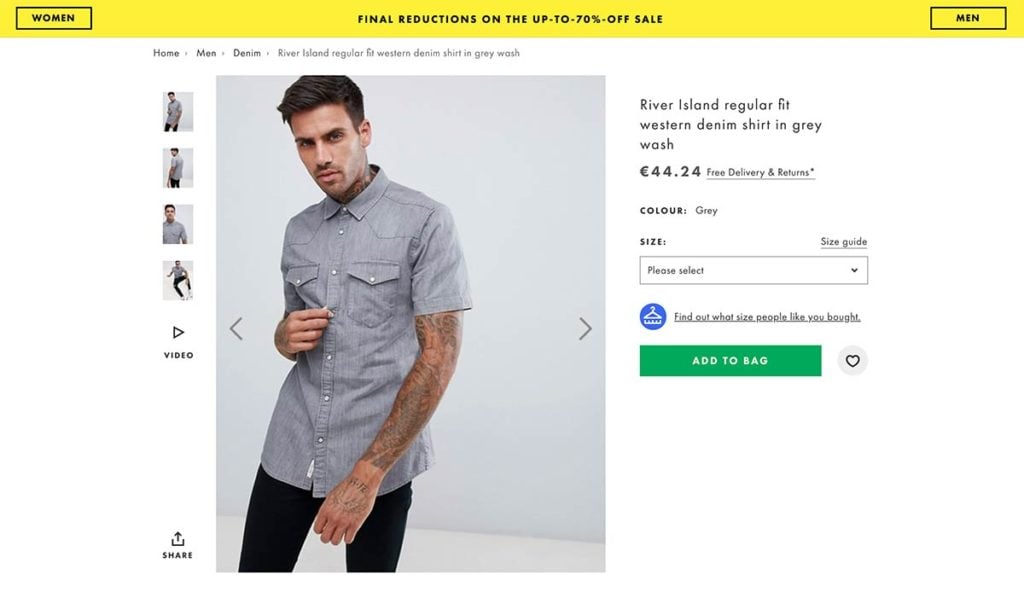
Whereas Columbia in the screenshot above gives the visitor no information on how much it would cost to ship that jacket, Asos does a lot better, including a link right beside the price with the text ‘Free Delivery & Returns’. Clicking it reveals a modal with more information and outlines that while standard shipping is free, expedited shipping has a fee.
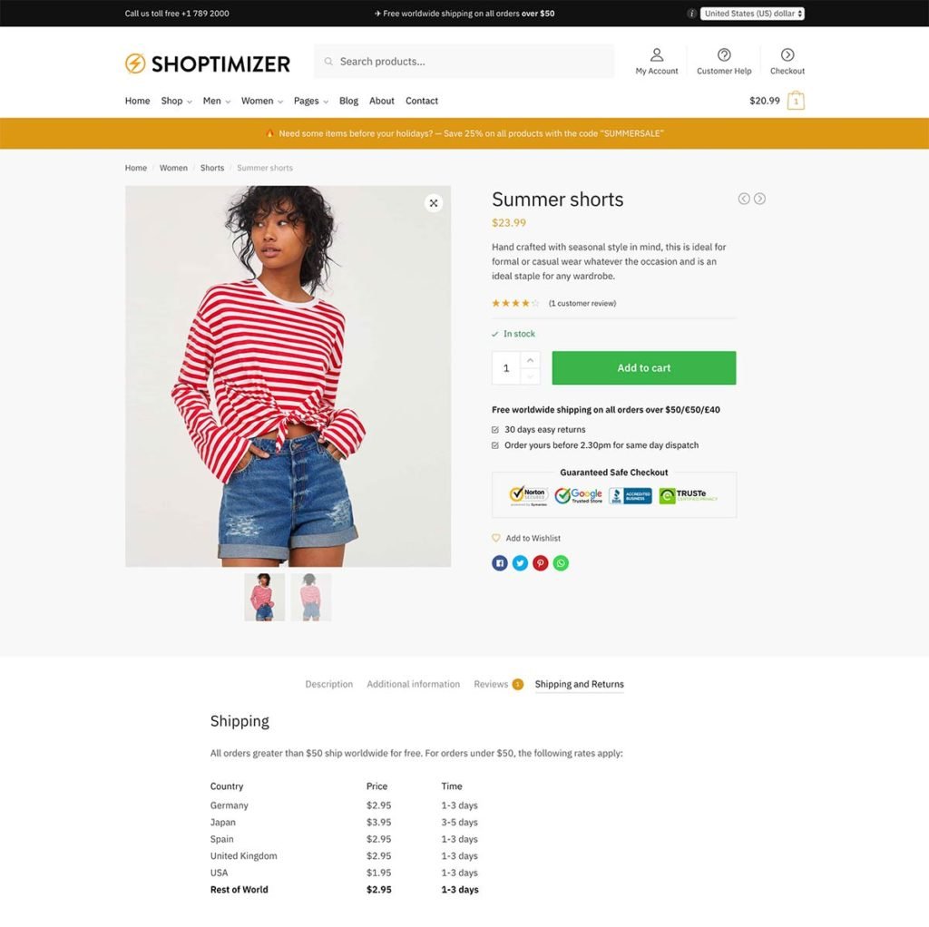
We wanted to ensure that you could do the same within Shoptimizer. That’s why we added a content area beneath the call to action button. Within this, we have a line about free shipping over a certain amount. We also added an additional tab called ‘Shipping and Returns’. Within, you can add a table of delivery rates and include various countries and methods for example.
Conversion rate tips – #4: Improve users perception of security during the checkout flow by implementing trust seals
Giving people the feeling of trust in your site to buy is absolutely crucial. You’re not an Amazon or Wallmart. You’re likely a small retailer and you’ll need to provide enough trust signals to convince users to buy. According to Baymard’s checkout study 18% of US users have abandoned a cart because they didn’t trust a site with their credit card information.
Of course, it’s essential that your site is running over SSL these days. Incorporating some of the major trust seal badges is also highly recommended. They denote business authenticity and are seen as a validation of your company and its practices.
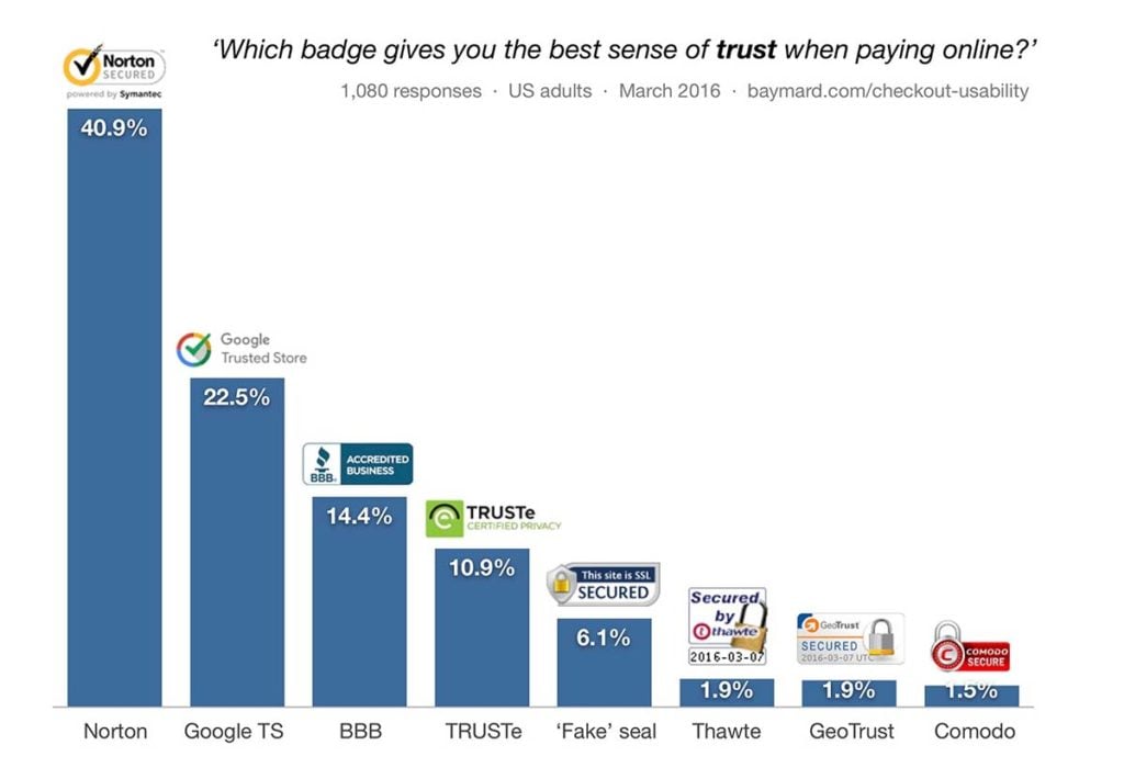
We’ve implemented content blocks within Shoptimizer to allow you to easily do likewise. Of course, you’ll need to actually sign up with any of the trust providers before displaying it! Norton’s trust seal comes included within Symantec’s SSL certificate and it is possible to find it for around $170 a year at the time of writing. If you think that sounds like a lot, work out how much 18% of lost business costs. You may think you’ll find it a bargain.
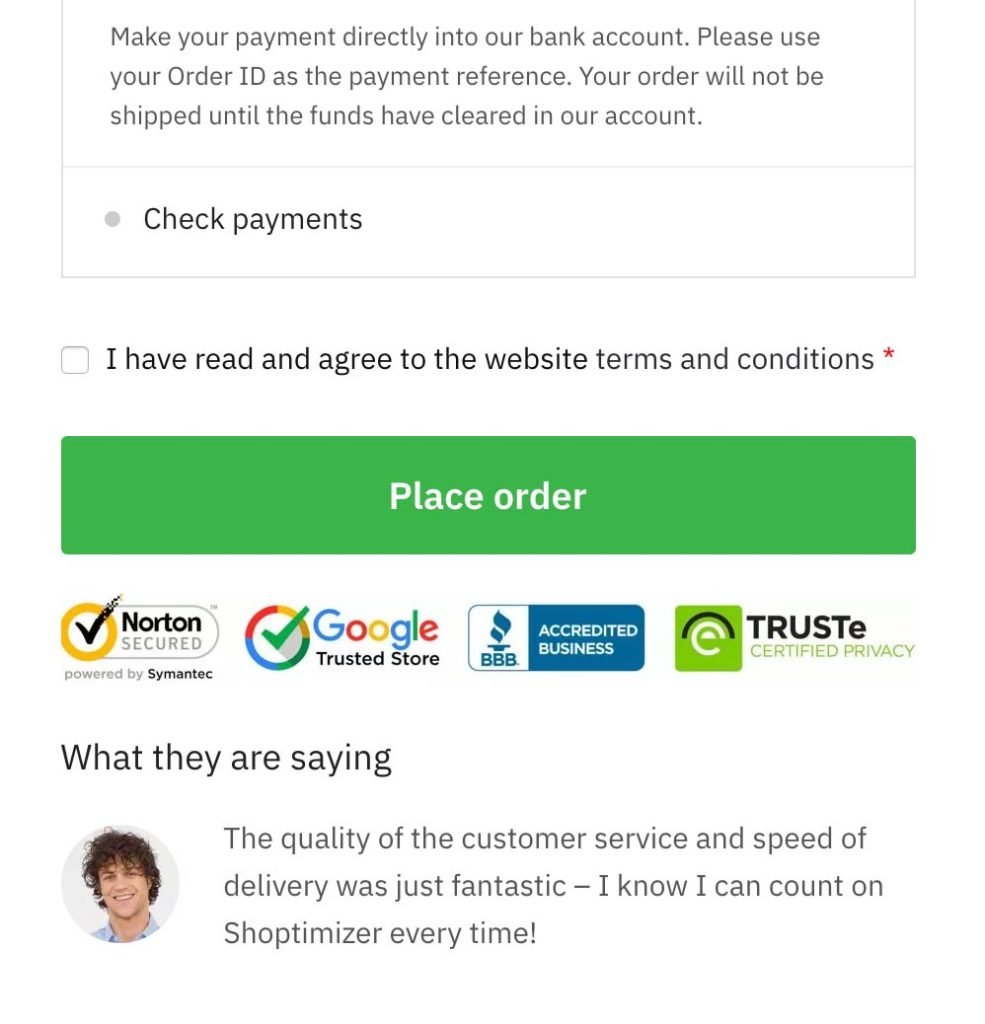
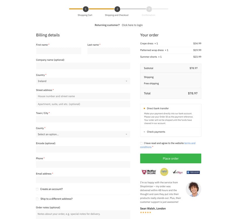
We’ve added three areas where trust seals (and other things) can be added within Shoptimizer; the single product page, the cart, and the checkout. The checkout is particularly important. It is where a buying decision can be won or lost. Including trust signals and perhaps testimonials from previous customers can be enough to carry some undecided shoppers over the line.
Conversion rate tips – #5: Improve your cart abandonment rates
(because 68% of users have done so)
Baymard’s cart abandonment data is one of the most important in their series. Fortunately, it’s one of the easiest to action. We’ve covered some of the points already, such as displaying delivery and returns on a product level and ensuring that trust badges are prominently displayed.
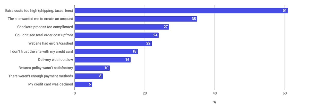
A crucial segment – 27% of users – have given up on the checkout process as it was too long or complicated. There are a number of plugins such as this one which allows users to remove or tweak checkout form titles. It’s critical not to remove any core fields but there are certainly some which can be removed safely and make your checkout more streamlined and remove points of friction.
Shoptimizer also includes a “distraction-free” checkout layout. This removes the header and footer and focuses the customer on the primary action – completing the order.
Wrapping up
Baymard is a treasure-trove of usability reports with real insights into making your store convert better. We’ve incorporated these proven conversion rate tips into our highly-optimized Shoptimizer WooCommerce theme. We’ll be continuing to improve this theme going forward, adding more conversion techniques into the future. We aim to make Shoptimizer the go-to theme for users who realize that the bottom line is the most important factor for any business. For 10% off Shoptimizer use the coupon code HERO on the cart page today!


 FlyingPress Review – An Easy Way to Improve Site Speed
 WooCommerce Subscriptions Tutorial: Create Your First Subscription Product
 Points and Rewards Loyalty Plugins for WooCommerce
 Shoptimizer 2.5 and CommerceKit 2.0 Revealed – Huge Update!
Epic guide. Cart abandonment is crucial.