Get a fast, conversion-focused WooCommerce theme in 2024. Switch to Shoptimizer.

eCommerce Popup Design Best Practices

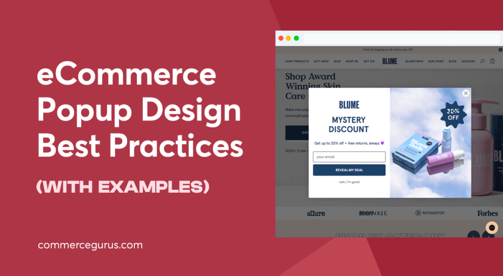
eCommerce Popup Design Best Practices

Adding popups to your eCommerce store is a proven and effective way to generate more sales, build a mailing list, and increase conversions for many of the other goals you might have.

However, simply enabling popups at your store is unlikely to yield positive results.

Instead, you need a plan for your popups. Considering their design, such as what colors to use, what content to display, and many other factors, is essential if you want popups to benefit your business.

Furthermore, as popups have the potential to annoy and frustrate your audience, poorly implemented popups can have a negative impact on your business.

In short, popups are a powerful tool with proven potential for benefiting your business.

However, they need to be thoughtfully implemented to deliver positive results. As popups can also cause problems, it’s even more important that you deploy them with consideration.

If you’d like to know how to do that, you’ve come to the right place.

In this guide, we cover eCommerce popup design best practices, giving you plenty of actionable tips to get the most from popups at your eCommerce store.

Why You Should Use Exit Intent Popups on Your eCommerce Store

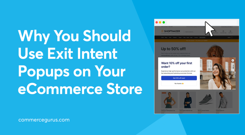
Why You Should Use Exit Intent Popups on Your eCommerce Store

If you’re not using exit intent popups at your eCommerce store, then you are almost certainly missing out on sales. These sales can be in the form of preventing cart abandonment and additional upsells to increase your average order value. You can also use exit intent popups to drive a huge increase in other metrics, such as subscribers, followers, and the number of reviews you receive.

Therefore if you’re not using them, exit intents are definitely something you should consider.

But what exactly are exit intent popups, and how do you implement them?

They’re the questions we’ll answer in this article. We also cover the different ways they can be implemented and share some real-life examples of them in use.

20+ High-Converting Examples of eCommerce Popups

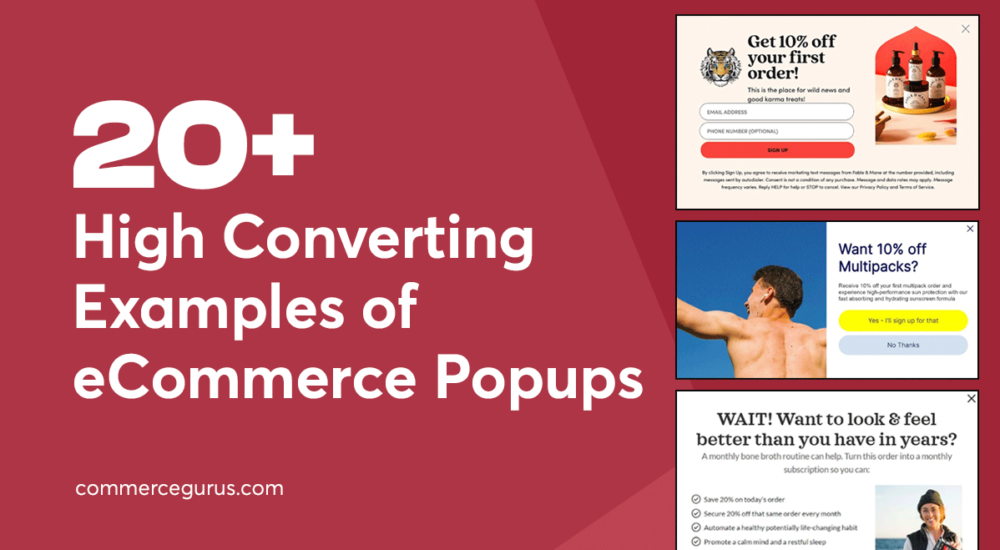
20+ High Converting Examples of eCommerce Popups

If you’re not using popups on your eCommerce store or you’re not getting the results from your existing popups, this article is for you.

After checking out these examples of high-converting eCommerce popups, you’ll either have plenty of inspiration for implementing this powerful marketing tactic at your store or you’ll gain a better understanding of how your popups could be improved.

Popups are definitely an essential tool for eCommerce store owners, but it’s not as simple as enabling a generic popup and then sitting back and reaping the rewards.

As we’re about to see, there are many ways to implement popups to get the results you want, and choosing the right type can make or break your campaign.

So if your popups aren’t as effective as you’d like, or you’re yet to start using this powerful marketing technique, this collection of high-converting examples of eCommerce popups will get you up and running.

Success!

The discount has been applied. You will see it when you checkout.

There has been a problem

Unfortunately this discount cannot be applied to your cart.