If you’ve worked hard to get customers to visit your store and add items to their carts, the last thing you want to do is turn them away due to a poor checkout user experience.
However, this is a common issue for eCommerce stores. According to research, 70% of online shoppers abandon their purchase after adding items to their cart.
There are many possible causes, but a poor checkout user experience (UX) is commonly cited in customer surveys
Some common issues that contribute to a poor checkout experience include unexpected costs at checkout, mandatory account creation, and limited payment options. However, as this guide will show, there are many more hidden issues affecting conversions.
So, if you want to reduce abandoned carts, our list of hidden checkout conversion killers highlights some of the issues that might be causing problems at your store. You’ll also find some examples of stores that get their checkout process just right.
Key Checkout Conversion Killers and Solutions
If you’d like to gain better insight into what might be causing abandoned carts at your store, especially for shoppers who’ve made it to the checkout, this list of hidden conversion killers will help.
1. Unexpected Costs Revelation
Top of our list of hidden conversion killers are unexpected costs that are revealed at the checkout page.
Discovering unexpected shipping costs, taxes, or additional fees at the final step of checkout can be highly frustrating for online shoppers, especially those ready to buy.
This perceived lack of transparency often leads to abandoned carts, as customers feel misled or unprepared for the final total.
To build trust and improve conversions, stores should provide clear cost breakdowns earlier in the shopping journey. Displaying shipping information on the product page itself is a good way to improve transparency and reduce surprises.
Another approach store owners can take is to implement shipping calculators that display estimated costs as soon as items are added to the cart. Implementing real-time integrations that calculate shipping fees based on the user’s location and selected delivery method helps provide customers with accurate pricing.
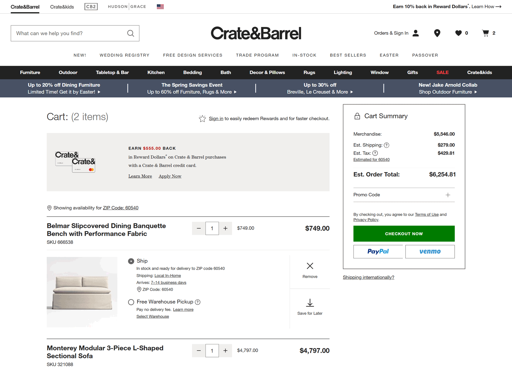
One store that implements this approach well is Crate & Barrel. At their stores, customers are shown estimated shipping costs in the cart before they reach the checkout page. Shoppers can also choose between multiple delivery options with clearly displayed prices for each one.
Adopting a similar approach can help you create a more seamless and transparent shopping experience, ultimately reducing friction and boosting sales.
2. Form Field Friction
Have you ever been overwhelmed by a complicated, cluttered checkout experience? If so, you’re not alone.
Excessive form fields, poor sequencing, and requests for redundant information slow down the process, making it feel tedious. This can lead to abandoned checkouts.
To improve the checkout user experience and increase conversions, you should focus on streamlining checkout forms by minimizing required fields, organizing them logically, and using smart defaults.
One effective approach is implementing conditional fields that appear only when necessary and using address verification to reduce manual entry. This ensures that customers provide only the essential details without unnecessary friction.
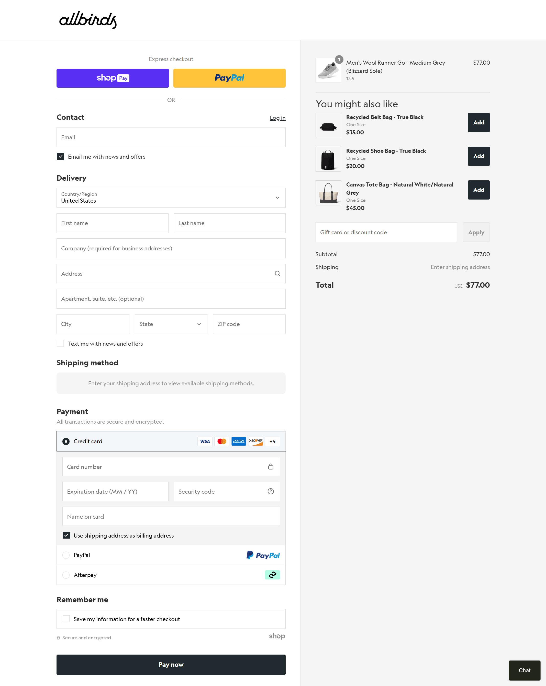
Allbirds provides a great example by offering a simplified checkout with minimal fields, intuitive grouping, and real-time inline validation.
Instead of merely flagging errors, the system actively confirms correct input, preventing frustration and allowing for a smooth, hassle-free purchase process.
3. Cognitive Overload
As well as excessive form fields, overwhelming shoppers with too many decisions or options can also drive them away.
This can come in the form of offers, upsells, and other decisions related to their order that aren’t entirely necessary—or at least don’t need to be displayed all at once.
Similar to analysis paralysis, being faced with excessive choices can cause buyers to hesitate or feel distracted. This can disrupt the checkout experience, leading to cart abandonment.
To avoid killing conversions in this way, you should implement a streamlined checkout experience that minimizes distractions and keeps the user focused on completing their order.
An effective solution is progressive disclosure, in which only relevant information is presented at each stage, and unnecessary elements are removed.
Implementing a single-column layout, clear progress indicators, and a distraction-free interface can help guide users smoothly through the checkout experience.
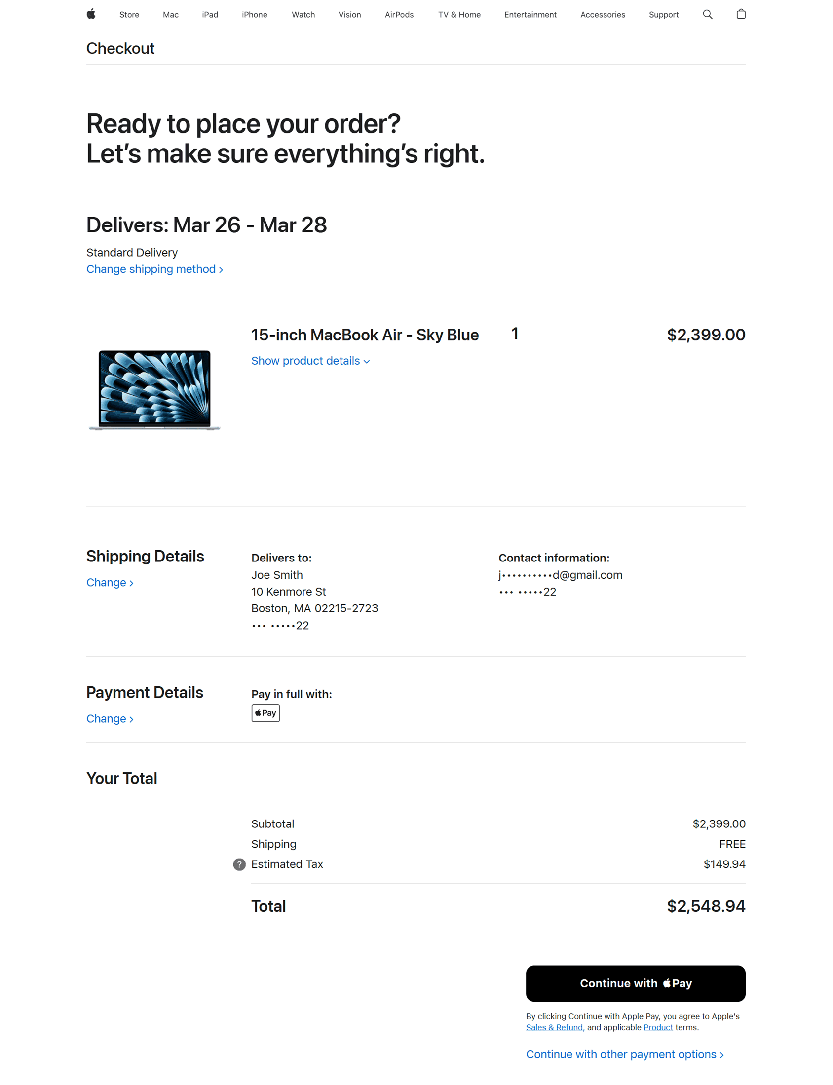
Apple is one online retailer that gets this right by offering a clean, focused checkout experience with minimal distractions.
By prioritizing simplicity and clarity, businesses can create a frictionless purchasing process that keeps customers engaged throughout the checkout experience.
4. Trust Deficit at Critical Moments
A lack of security reassurance at critical moments of the shopping experience can understandably make customers hesitant to enter sensitive information, leading to abandoned checkouts.
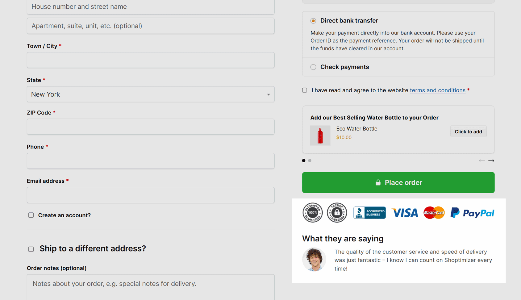
One way to rectify this is to display trust badges at your store. However, generic trust badges aren’t enough—shoppers need clear, contextual reassurance when providing payment details.
A better approach is to place trust signals where they’ll be most effective, such as next to payment fields. This can include inline security messaging, encryption details, fraud protection explanations, and customer testimonials.
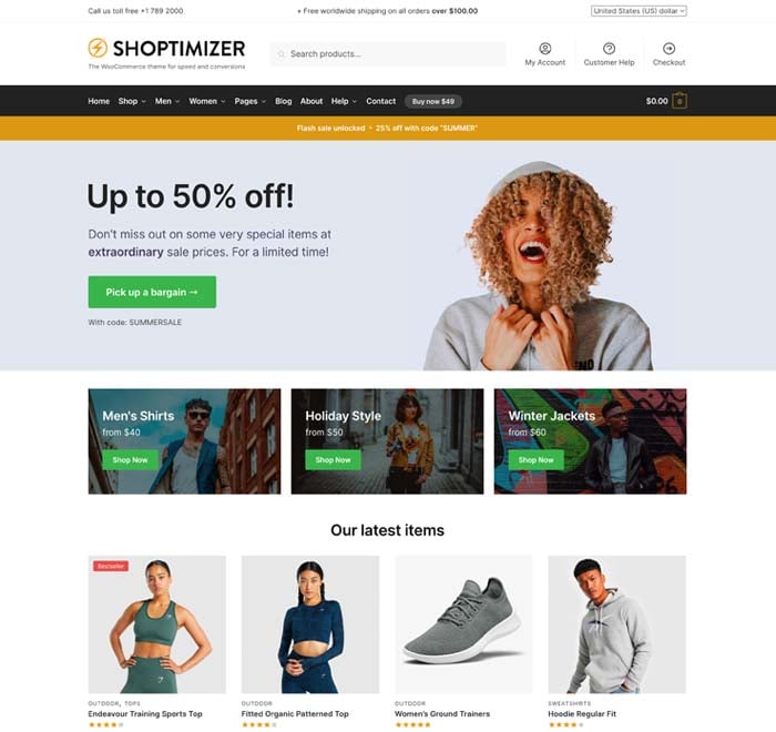
To quickly add trust badges to your WooCommerce store, you could consider switching to the Shoptimizer theme. These elements are used throughout the templates, including the checkout page. To see them for yourself, visit the Shoptimizer demo, add an item to your cart, and then browse to the checkout page.
By reinforcing trust at key moments, businesses can reduce hesitation and increase checkout completion rates.
5. Mobile-Specific Abandonment Triggers
Mobile checkout abandonment often stems from form issues like improper keyboard types, zooming requirements, and difficult navigation.
If the checkout process feels clunky or frustrating, users are more likely to abandon their purchase
The solution is mobile-specific optimization, including appropriate keyboard inputs, touch-friendly buttons, and streamlined forms. It is highly recommended that you consider a mobile-first design for your store.
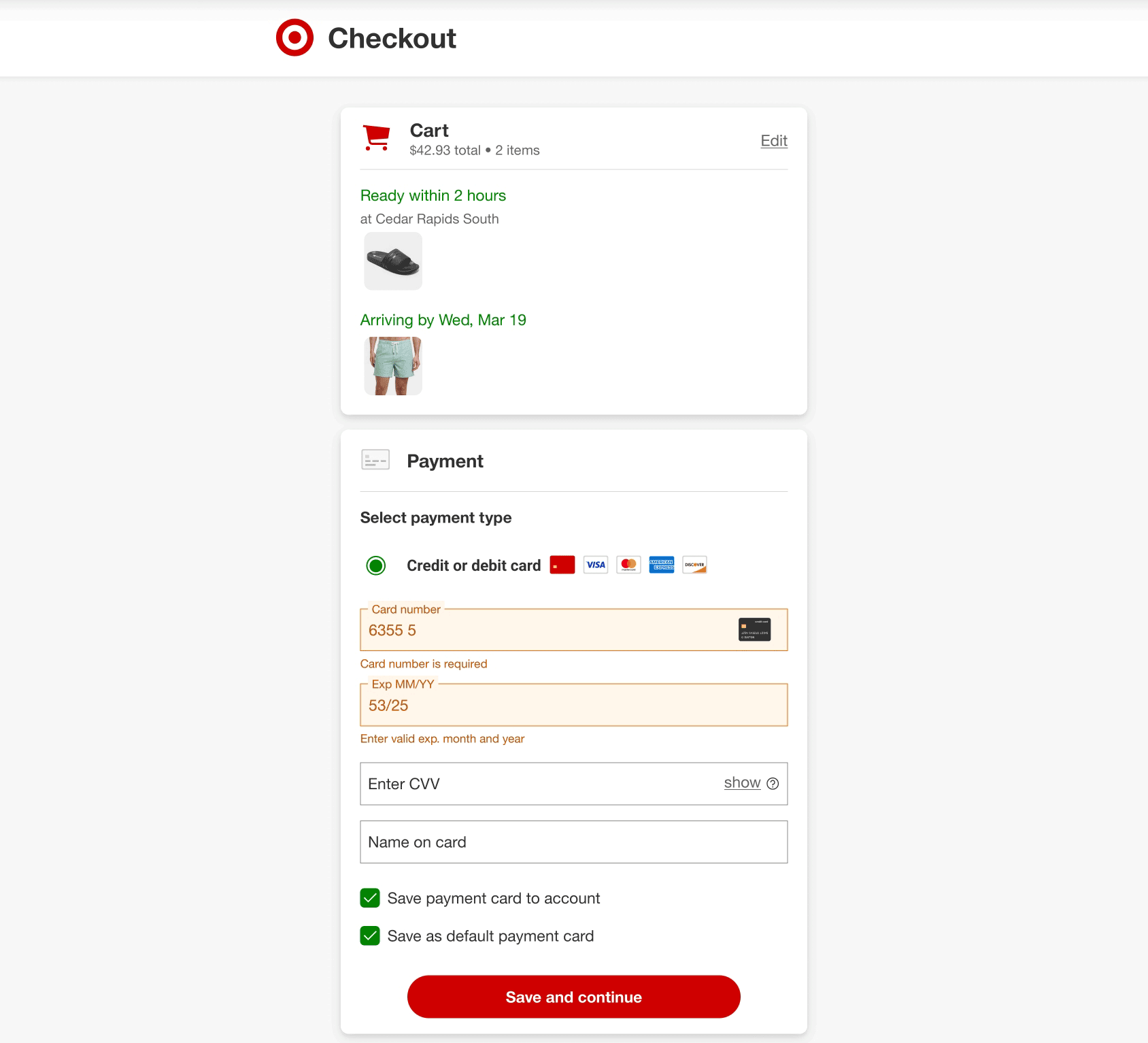
When it comes to online stores that do this well, Target is one example. They excel in this area by offering a seamless mobile checkout with easy-to-tap elements and fields that don’t require excessive scrolling or zooming.
By tailoring checkout flows for mobile users, businesses can reduce friction and boost conversions.
6. Account Creation Friction
Forcing account creation before checkout can disrupt the purchase flow and lead to abandoned carts. Customers want a quick, hassle-free experience, not an extra step that slows them down.
A better approach to forced account creation is allowing guest checkout while offering optional account creation after purchase.
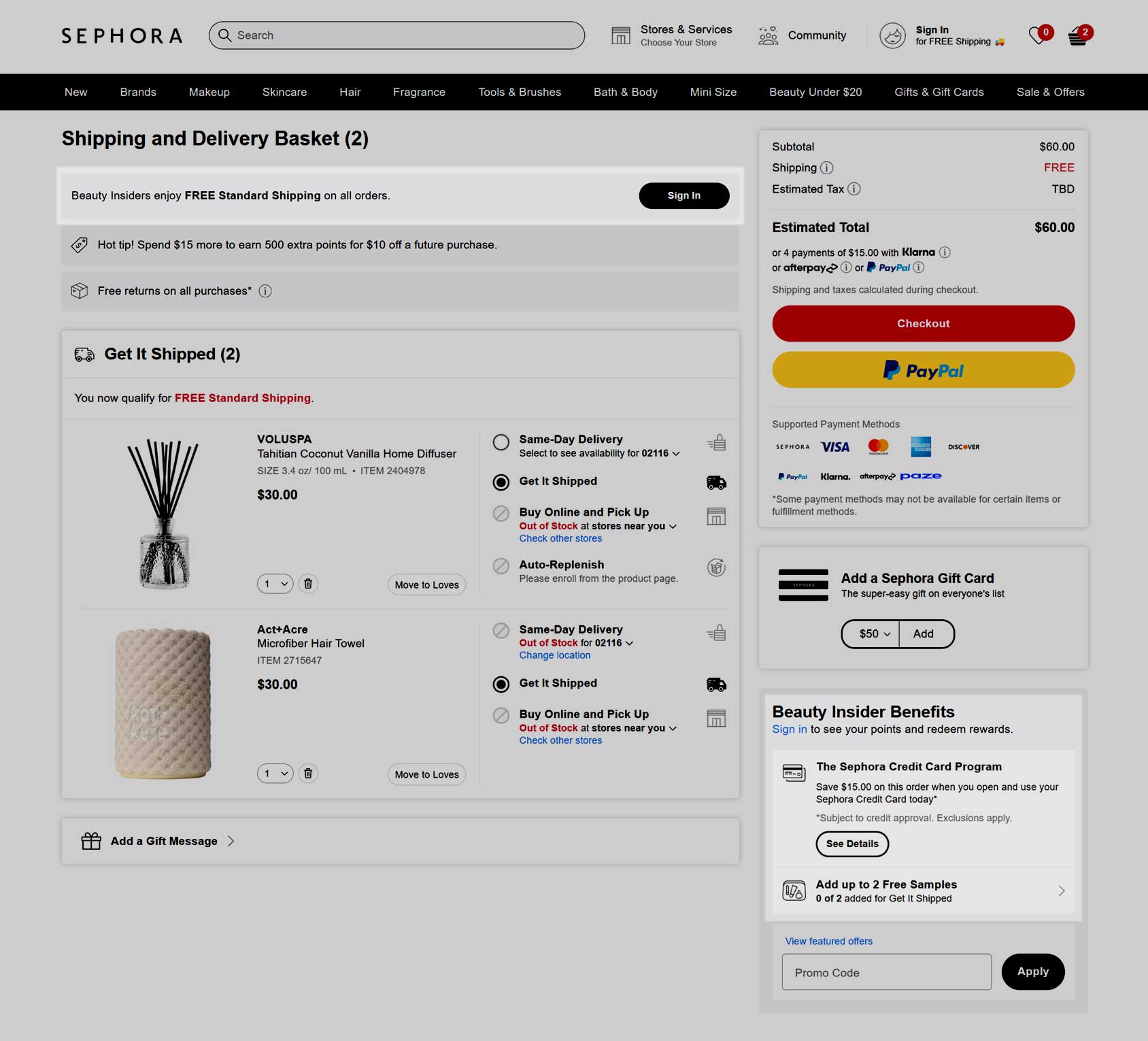
Sephora’s eCommerce store does this well by streamlining guest checkout and highlighting the benefits of joining their Beauty Insiders program after purchase without making it a requirement.
This keeps the checkout process smooth to avoid abandoned carts while still optimizing for new signups.
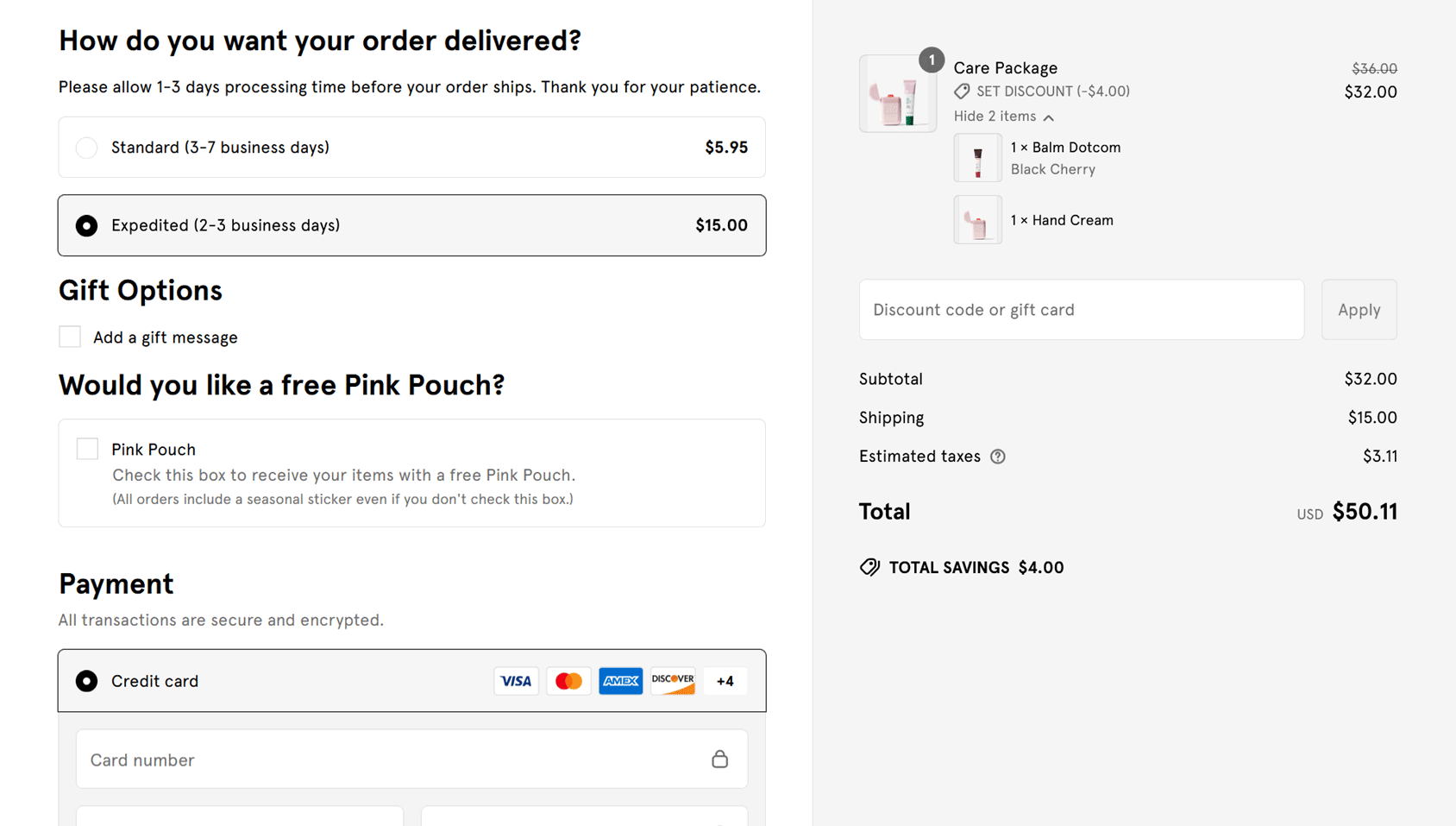
7. Payment Method Limitations
Limited payment options could be killing your conversions and causing abandoned carts due to customer frustration.
A lack of flexibility at checkout can be a significant barrier, particularly for international shoppers or those using alternative payment solutions. Even if a customer’s preferred payment method isn’t supported, they might leave empty-handed.
Due to this, you should strategically expand payment methods and display them prominently.
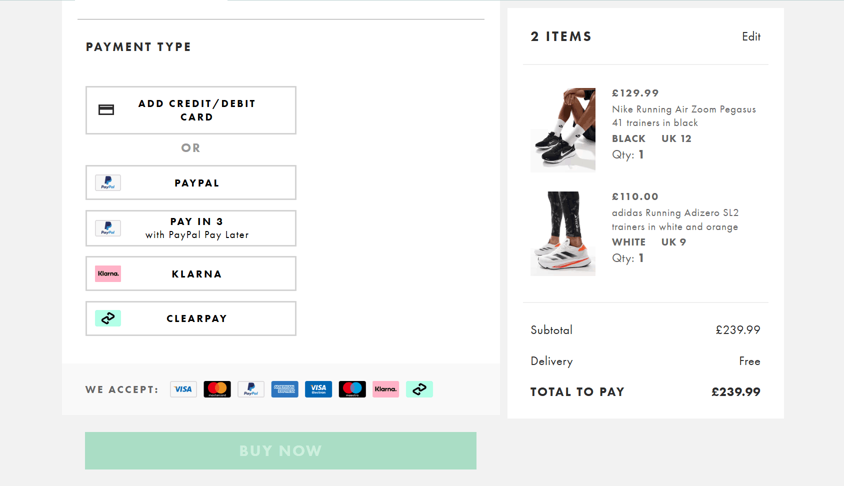
ASOS excels at this by offering a wide range of options and highlighting them with clear visual icons. It’s a good example of strategically choosing options that suit its target demographic, such as buy-now-pay-later services.
By catering to different customer preferences, brands can reduce friction and increase conversions.
8. Error Recovery Failures
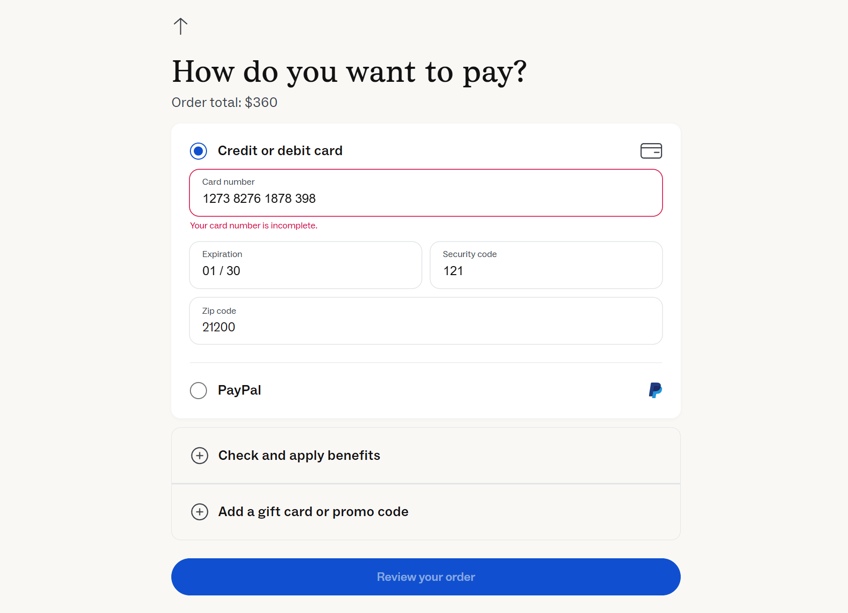
Poor error handling can frustrate customers at the best of times, let alone on checkout pages.
This is especially true when vague error messages or lost data force them to restart the checkout process. Confusing errors can lead to abandoned purchases rather than successful corrections.
A better approach is using inline validation and clear, friendly error messages that guide users without disrupting their progress.
Warby Parker does this well by displaying helpful messages next to the relevant fields while preserving all entered information. This lets shoppers quickly identify problems in real-time and correct them with minimal effort.
User-friendly error handling ensures a smoother experience and higher checkout completion rates.
Examples of Exemplary Checkout Experiences
Here are some examples from stores that get it right to illustrate some of the above points and inspire your own checkout experience.
1. Bellroy
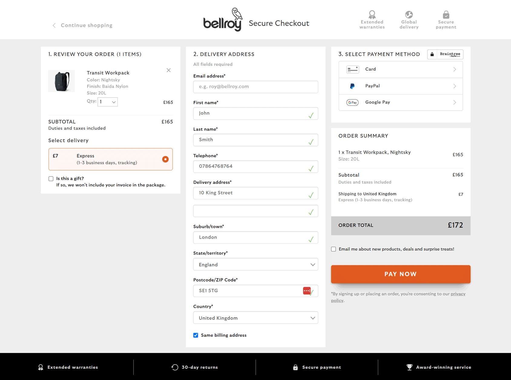
Bellroy does an excellent job of delivering a distraction-free checkout experience. Everything is kept to a single page to streamline the process of making a purchase.
While the number of fields on a single-page checkout has the potential to overwhelm visitors, Bellroy avoids this by progressively revealing fields once a selection has been made, such as those related to the customer’s preferred method of payment.
2. Glossier
Glossier clearly outlines the shipping options, complete with prices, on its checkout page.
The minimalist layout and clear error messages should ensure that customers can provide all of the necessary information without getting distracted by non-essential content and links to other parts of the store.
3. Everlane
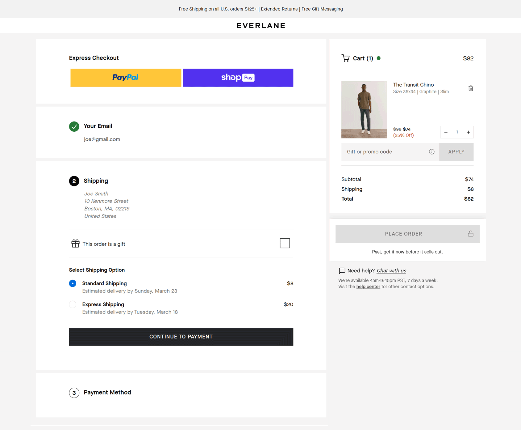
Everlane provides another excellent example of a single-page checkout that only shows the relevant fields as the shopper moves through the necessary steps.
The shipping options and costs are transparently displayed through the checkout experience to avoid surprising shoppers. Automatic field population reduces form friction, clear error labels make it easy to see if anything has been entered incorrectly, and the option of checking out without creating an account all combine to reduce abandoned carts as much as possible.
4. Patagonia
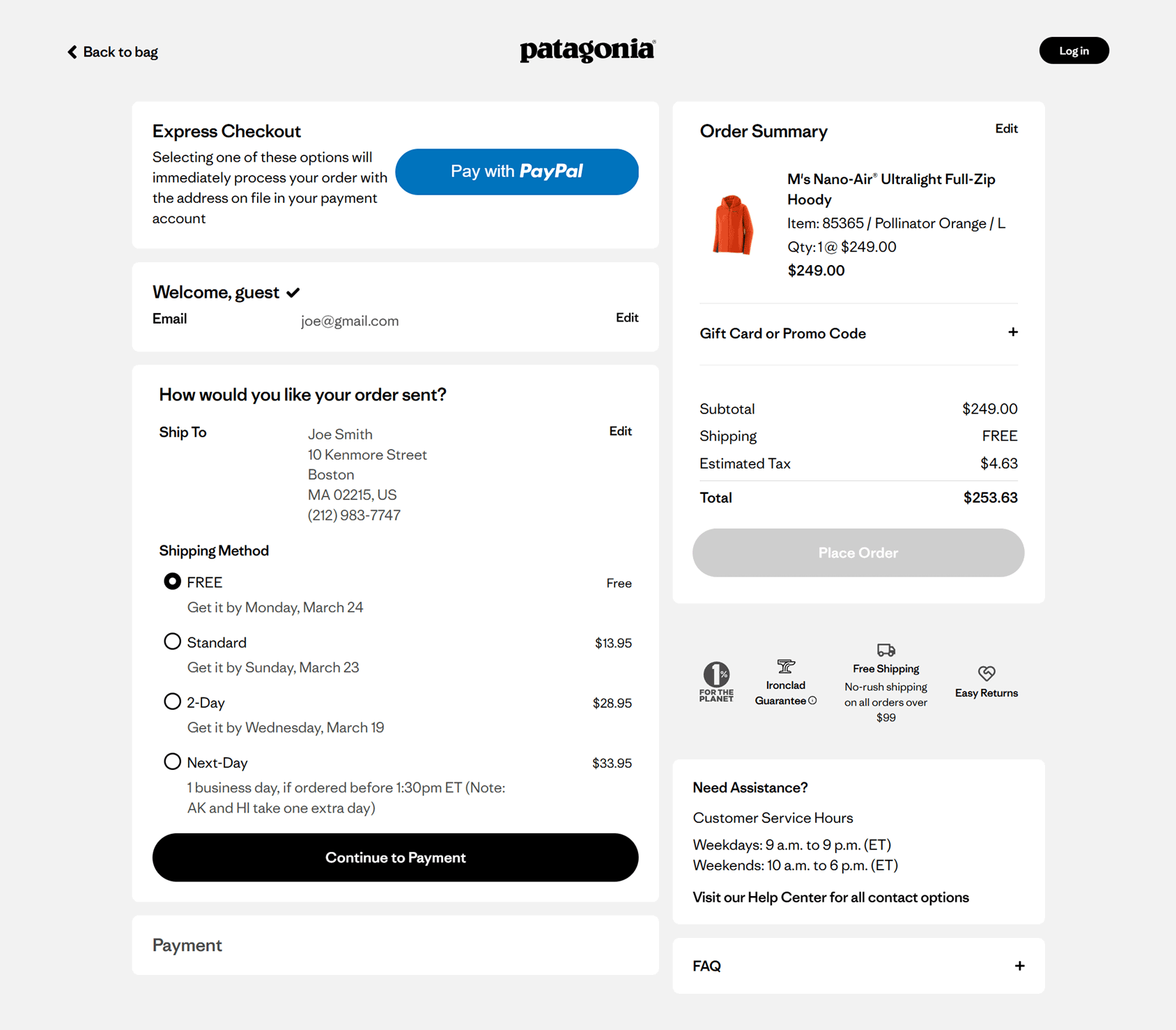
Patagonia displays logos related to its values on the checkout page to remind shoppers why they’ve chosen this brand and help overcome any last-minute doubts customers might have about buying these premium products.
The overall checkout experience is very user-friendly, thanks to the ease with which customers can check out as a guest or create an account. Fields are validated in real-time, ensuring mistakes are flagged instantly and easy to correct.
5. Away
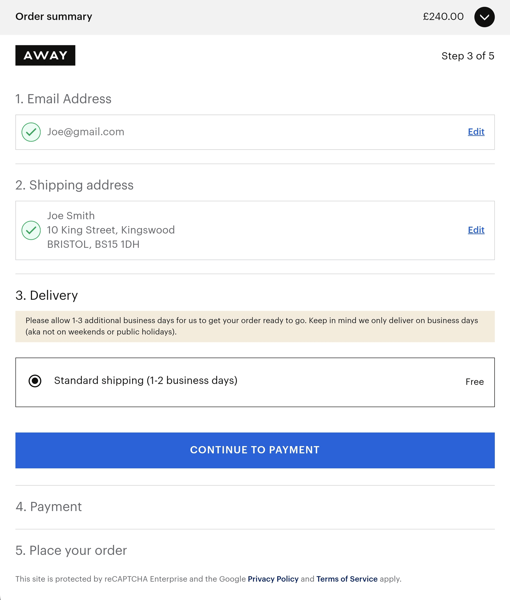
The minimal design of the Away checkout page works equally well on desktop and mobile devices. Auto-populating fields reduces shoppers’ cognitive load, while the lack of distracting elements keeps them focused until the end.
6. Lululemon
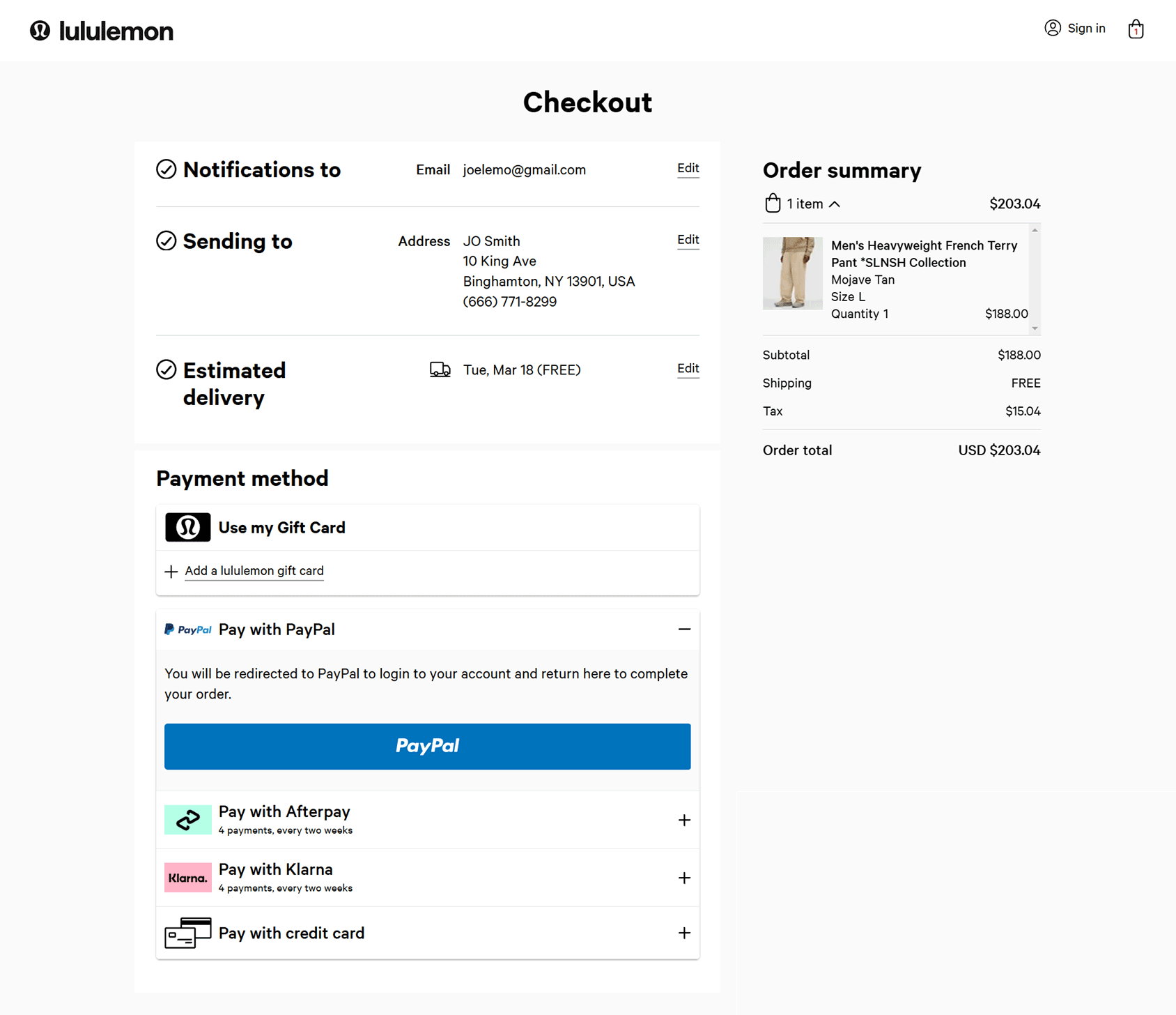
At Lululemon, the checkout page fields are organized into sections, with only the fields from one section visible at a time. This method effectively minimizes distractions and field overwhelm.
Shoppers can easily go back to a previous section at any point, and with no unnecessary elements on the checkout page, they’re more likely to make it through to the end.
7. Chewy
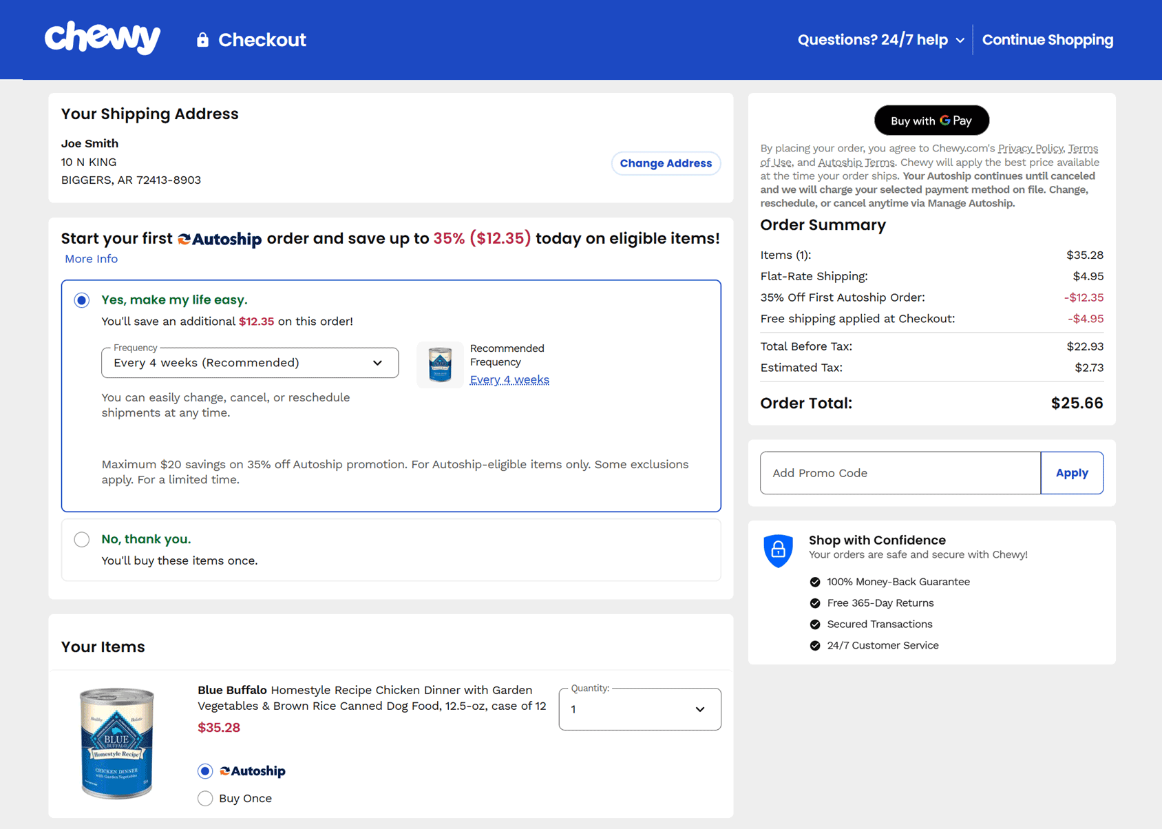
Online retailers prefer customers to create accounts, but they also know that not offering guest checkout increases cart abandonment.
To address this, Chewy effectively encourages account creation by offering a discount on the order.
Unlike some other big-brand retailers, Chewy still lists the benefits of shopping with them on its checkout page, such as its generous returns and refund policies.
Summary
Optimizing the checkout process is crucial for reducing cart abandonment and maximizing conversions. As we’ve just seen, hidden friction points—such as unexpected costs, lengthy forms, distractions, and payment limitations—can frustrate customers and drive them away. By addressing these issues with transparency, streamlined design, and innovative technical solutions, you’ll be able to create a smoother and more user-friendly experience.
Leading retailers like Crate & Barrel, Allbirds, and Apple demonstrate how transparent pricing, intuitive forms, and distraction-free layouts can improve checkout success rates. Additionally, reinforcing trust through trust badges, offering mobile-friendly designs, and allowing guest checkout helps eliminate common barriers.
By refining the checkout experience and removing unnecessary hurdles, eCommerce stores can increase customer satisfaction and generate more sales.

 WooCommerce Gift Card Tutorial: How to Sell Gift Cards at Your Store
 WooCommerce 2.2 Released – Captiva 100% compatible
 Best Caching Plugins for WooCommerce