Have you ever landed on a website to read an article or find out more about a product when suddenly the page elements shifted? Or maybe you missed the button right as you were about to click it and ended up clicking a pesky ad instead?
It’s probably fair to say that you had an unpleasant experience on the website.
This type of issue is particularly annoying on eCommerce sites where unexpected layout shifts can cause customers to lose trust in the store, make shopping difficult, and lead to abandoned carts.
Cumulative layout shift (CLS) is a user-centric metric for measuring visual stability. It’s important because it helps us quantify how often users experience layout shifts when browsing a web page. Ideally, you want to have a low CLS number. In other words, the higher the CLS, the more layout shifts affect user experience on your site.
In this article, we’ll take a look at why layout shifts happen, what CLS is, and how you can calculate it. We’ll also go over some actionable tips to help you reduce CLS on your website.
Why Layout Shifts Happen
Before we jump into what CLS is, let’s take a look at why layout shifts happen on your website.
According to Google, there are five reasons why layout shifts happen on websites:
Reason #1: Images without dimensions
Ever since responsive web design became necessary, developers stopped using the old way of resizing images by adjusting their “width” and “height” manually. Instead, they started using CSS to resize and adjust images.
The problem with using CSS to resize images is that it causes a massive layout shift. This is because the page space for the image can only be allocated once the image is downloaded. The image will require some page space to be displayed when it’s done downloading. This causes a layout shift on your website.
This is a common problem on the product pages of WooCommerce stores and eCommerce sites in general. Online shops feature large product images, galleries, and thumbnails that load dynamically and can easily cause layout shifts if dimensions aren’t defined.
Reason #2: Ad embeds and iframes without dimensions
Preventing layout shifts with ads is pretty tricky because a lack of ad inventory can cause the ad to not show up thereby resulting in a layout shift.
One possible way of dealing with this would be to style the element where the ad is shown. You can style the div to a specific width and height and ensure your ad is restricted to specific pixels.
Additionally, providing an alternative banner ad or a placeholder image file to fit the allocated space may also prevent layout shifts and reduce CLS. Depending on your theme, you might be able to get away with not causing a layout shift if you run into an ad inventory issue. For instance, if your layout has an ad that fills the entire top row of a column on the right or left side of your page, consider using a placeholder image. This way, layout shifts will be easier to avoid if the ad doesn’t show up, even on mobile devices.
WooCommerce stores may experience similar problems with promotional banners, cookie notices, upsell elements, or third-party integrations that work in the same way as ad embeds and load asynchronously.
Reason #3: Dynamically injected content
Content that is injected into a web page through share links from other websites can cause layout shifts. For instance, if you provide a link to a YouTube video on your WordPress site, it will display the video in the link as an embed object. So if the video doesn’t load up, CLS values might go up as well causing a layout shift.
On WooCommerce sites, dynamically injected content such as cart notices, shipping calculators, review widgets, or related product sections can also contribute to layout shifts if space isn’t reserved in advance.
Reason #4: Web fonts causing FOUT or FOIT
A common problem with downloading web fonts is the Flash of Invisible Text (FOIT) and the Flash of Unstyled Text (FOUT).
You can use rel=”preload” in the link for downloading web fonts thereby eliminating FOUT and FOIT. You can also use Lighthouse to really dig deep into what is causing high CLS scores.
Reason #5: Actions waiting for a network response before updating DOM
When resources are loaded suddenly or when DOM elements are added to the page over the existing content, it causes unexpected movement of page elements on your website. Generally speaking, images or videos without dimensions, a font not rendering exactly like its fallback, third-party ads, or a widget that resizes itself are the main reasons you might run into this problem.
Websites in the development phase are most prone to some of these problems as everything functions differently while the website is being built than it will in production. Due to browser cache and local API calls, developers sometimes aren’t able to see the problems as everything is already loaded up and ready to be displayed.
However, the end user’s experience might be completely different.
They might face problems that the developers never experienced during testing in a pre-production environment. One way to address this problem is by measuring how often real users experience layout shifts and optimizing CLS scores.
What is CLS?
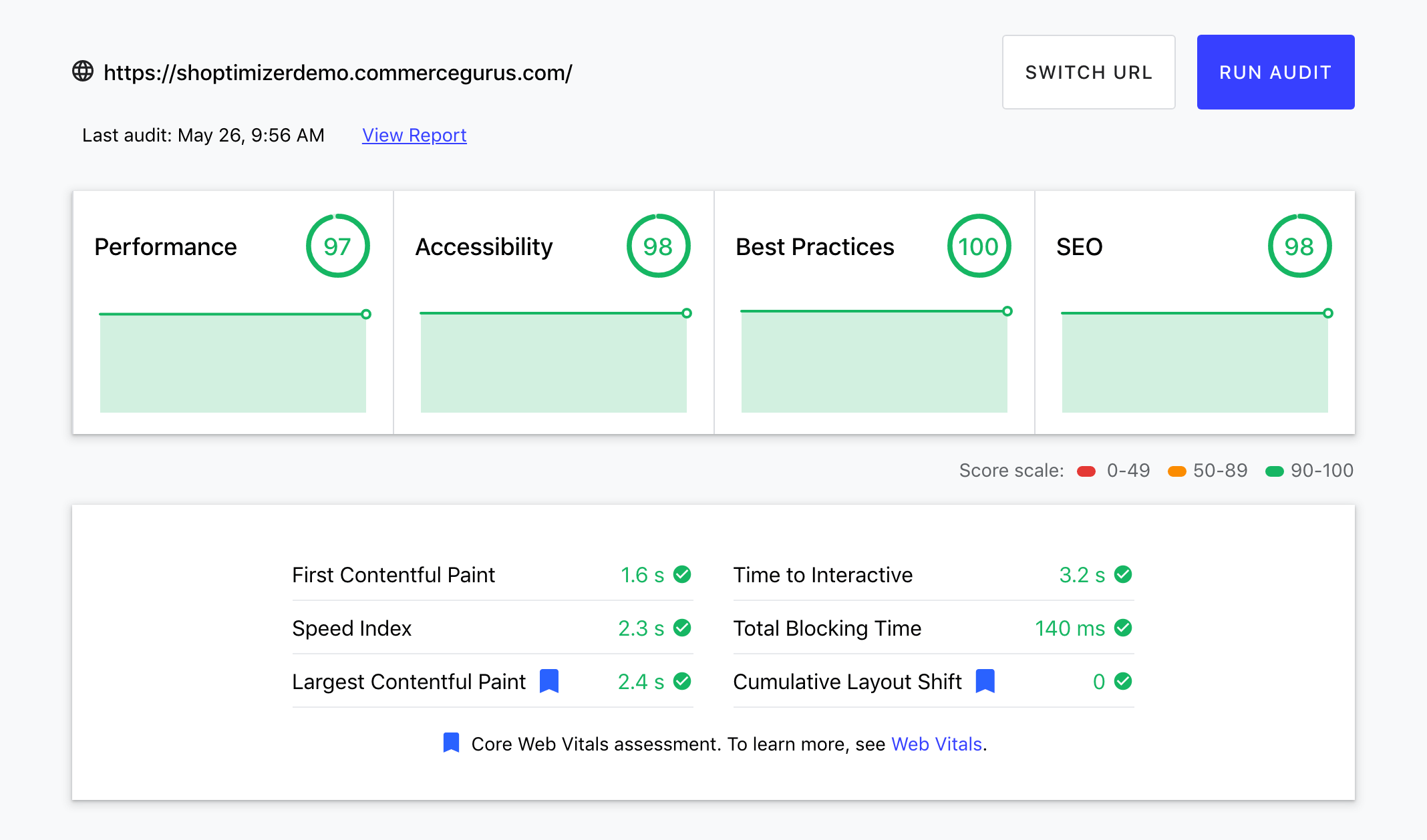
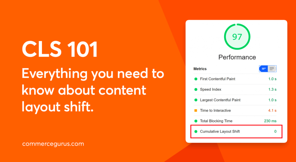
Cumulative layout shift (CLS) measures the total sum of all individual layout shift scores for each unexpected layout shift that occurs during the whole lifespan of a page.
There’s a lot to unpack here so let’s start from the top.
When page elements such as images, videos, fonts, contact forms, and buttons move around unexpectedly while the page is still being downloaded, this causes a cumulative layout shift. Reducing CLS is important in maintaining Google’s page experience ranking, while also passing the Core Web Vitals signal.

For WooCommerce stores, a high CLS score doesn’t just affect rankings; it can also negatively impact user experience, trust, and conversion rates, especially on mobile devices.
A layout shift can be seen whenever an element changes its location from a rendered frame to the next rendered frame in line. Maintaining a good, low CLS score is important. Ideally, you should aim for less than a 0.1 CLS score.
Due to the impact layout shifts have on eCommerce stores, it’s important to aim for a CLS score as close to zero as possible. This is especially true for the product, product category, and checkout pages, where any disruption to the user experience can harm conversion rates.
Pro tip: To make sure you’re getting the most accurate CLS score, measure the 75th percentile of page loads, segmented across mobile and desktop devices.
Unexpected versus expected layout shifts
Unexpected shifts may be bad for CLS but expected layout shifts aren’t bad at all.
Expected layout shifts usually happen because of user interaction with elements on the web page. For example, if a user decides to click on the search button on top of the screen, a search bar will appear on top while pushing the entire web page down.
While this does shift the content down a little bit, it does not affect CLS because it’s an expected shift. Google counts a 0.5 second (500ms) of delay after the last user interaction before it starts counting it as your CLS score.
You can easily measure CLS in the Lab and in the Field:
- In the Lab. Use Lab tools such as Chrome DevTools, Lighthouse, WebpageTest to measure CLS in the Lab.
- In the Field. Use Field tools such as Chrome User Experience Report, PageSpeed Insights, and Google Search Console.
WooCommerce store owners should use these tools to measure the CLS of the key eCommerce pages, including the product and checkout pages.
How is CLS Calculated?
CLS involves two events: impact fraction and distance fraction. You need to determine both in order to calculate CLS.
Impact fraction
Impact fraction is the measurement of how unstable elements affect the viewport area between two frames. It is the union of the visible areas of all the unstable elements for the previous frame and the current frame as a fraction of the total area of the viewport.
For example, let’s say an image takes half of the viewport in one given frame. In the next frame, the same image shifts down by 25% of the total viewport height. This adds to the total viewport which was 50% before the shifting of the element. Now, it’s a total viewport of 75%. The impact fraction here would therefore be 0.75.
Distance fraction
Distance fraction is the measurement of the distance the unstable elements may move relative to the viewport. It is the greatest distance any unstable element has moved within the frame divided by the viewport’s largest dimension. Unstable elements are calculated either horizontally or vertically and the viewport’s largest dimension can either be the width or height, whichever is greater.
For example, let’s say an element moves by 45% of the viewport height which would be greater than the viewport’s width. This makes the distance fraction 0.45.
Calculating CLS scores
To calculate the CLS score, you need to find the impact fraction and the distance fraction which is the movement of unstable elements between two frames within the viewport. Multiplying the impact fraction with the distance fraction gives you the layout shift.
CLS score = impact fraction * distance fraction.
How to Reduce CLS
The good news is that there are many ways to reduce a WooCommerce store’s CLS score and improve the user experience on your web page. It’s a good idea to measure your CLS score before making any modifications to your website. This way, you can see the exact impact each modification has.

Here are four ways of reducing CLS scores:
#1: Preload web fonts
By using the Font Loading API, you can significantly reduce the time it takes to download web fonts. Additionally, the font-display tool allows you to change the rendering custom fonts to different values. These include swap, auto, fallback, block, and optional. This helps speed things up and ultimately reduces your CLS score.
It’s also worth noting that preloaded fonts have a better chance of meeting the first contentful paint, as well.
#2: Use aspect ratios for images
Now that mobile-responsiveness is necessary, most browsers automatically set the default aspect ratio of images based on the image’s width and height. This causes high CLS. On WooCommerce stores, this can affect product images, galleries, and featured images.
Including width and height attributes on your images and videos is the most effective way to prevent CLS. This way, the browser’s UA style sheets will add a default aspect ratio based on the element’s width and height attributes that you put in earlier.
All of this happens before the start of the cumulative layout shift score calculation, which tremendously reduces CLS. Let’s say you aren’t able to add an image’s dimensions and aspect ratio to the page’s HTML. In this scenario, you can simply estimate the aspect ratio and use the CSS command “object-fit:contain” to make the image fit and not cause any layout shifts.
#3: Define space for ad slots
If you can define the space for ad slots by offering dynamic ad sizes, you’ll reduce CLS effectively. By styling the elements before the ad library gets a chance to load them, layout shifts can be prevented.
Additionally, you can statically style slot DOM elements that have the same size attributes which are sent to the tag library. By reserving a place or the slot size, you ensure that layout shifts will be reduced significantly for when the ads are loaded off-screen.
On the other hand, if there’s no space available, the tag library may change the size of the ad after the page layout has loaded. This is the worst-case scenario for the user as it may drop right where the user intends on clicking, causing a negative user experience.
The same advice applies to common WooCommerce elements, including promotional banners, trust badges, cross-sell sections, or dynamically loaded offers that appear within carts, product pages, or the checkout area.
#4: Determine space needed for embeds
You are able to predetermine space for embeds by providing a placeholder or fallback. By thinking ahead and creating a placeholder for the embeds that need to be placed on the web page, you ensure that CLS will be reduced on your web page. All you have to do is obtain the height of your embed. Once that’s done, style a placeholder for the embed by using the same dimensions.
Conclusion
Hopefully, you now have a better understanding of cumulative layout shifts. By following the tips we shared above, you can aim for a lower CLS score.
To recap, here a few pointers to keep in mind whenever you face layout shift problems:
- Define the height and width attributes when working with image and video elements to reduce CLS. Additionally, responsive elements need to have the same aspect ratio for each viewport to prevent layout shifts.
- Using placeholder images for ads for your web page ensures your layout doesn’t shift even a little bit. This is because you’re already leaving space for the ad to load in.
- By using a placeholder or a skeleton UI to allocate space for dynamically injected content you ensure elements don’t shift after the page is loaded. Avoid injecting dynamic content over the existing content for better CLS.
- Using font-display values such as swap, block, auto, fallback and optional, when using downloaded web fonts is important for reducing CLS. Additionally, adding rel=”preload” helps in loading web fonts before a DOM tree is rendered and constructed.
Armed with these tips, you’re now in a better position to enhance your site’s user experience and improve your CLS score.
For WooCommerce stores, improving CLS is particularly important and beneficial as it can reduce accidental clicks, increase trust, and improve conversions.
Remember, you can get our fantastic Shoptimizer WooCommerce theme for low CLS scores for your eCommerce store right off the bat!
Cumulative Layout Shift FAQ
What is CLS?
Cumulative Layout Shift (CLS) is a Core Web Vitals metric that measures how much page elements move unexpectedly during loading. Lower CLS scores indicate a page is more stable and likely to provide a better user experience.
Why does CLS matter?
Layout shifts can make a site feel unprofessional and reduce conversions. Google also takes CLS into account when determining search rankings.
What is a good CLS score?
A good CLS score is 0.1 or less. For eCommerce stores, aim as close to 0 as possible, as layout shifts can frustrate shoppers, harm your brand, and reduce conversions.
How is CLS calculated?
CLS = impact fraction * distance fraction.
- Impact fraction measures how much of the viewport is covered by moving elements.
- Distance fraction measures how far elements move relative to the viewport.
How can you measure CLS?
You can measure CLS using a combination of lab tests and field data.
Lab tests simulate page loads in a controlled environment. Tools like Chrome DevTools and Lighthouse let you see layout shifts as they happen. The CLS Debugger is a very useful tool that generates a GIF showing all the desktop and mobile shifts and lists all of the problematic elements on a page.
Field data measures how real users experience your page. Tools like the Chrome User Experience Report (CrUX) and Google Search Console’s Core Web Vitals report show actual CLS scores from visitors.
Using both types of tests provides a more complete picture of a page’s stability and how users experience layout shifts in the real world.
What causes layout shifts?
The leading causes of layout shifts and, therefore, a high CLS score are:
- Images without dimensions: If an image doesn’t have a set width and height, the browser can’t reserve space for it, so the page jumps when it loads.
- Ads or iframes without dimensions: Ads and iframes can push content around if their size isn’t reserved.
- Dynamically injected content: Pop-ups, notifications, banners, or product carousels that appear after the page loads can shift other content down.
- Web fonts causing FOUT or FOIT: Custom fonts that load late can change text size, causing layout shifts (FOUT = Flash of Unstyled Text, FOIT = Flash of Invisible Text).
- Actions waiting for a network response before updating the DOM (Document Object Model): Any content that only appears after data loads from the server (like related products or stock availability) can move page elements when it finally renders.
How can you reduce CLS?
The best ways reduce a high CLS score and make your page more stable while it loads include:
- Preload web fonts: Use the Font Loading API to speed up font downloads, and set font-display: swap (or another appropriate value) so the text is visible while the custom font loads. Preloading fonts helps them load sooner, improves the first contentful paint, and reduces layout shifts, ultimately lowering your CLS score.
- Use aspect ratios for images: Add width and height attributes to images and videos so browsers can reserve space and prevent layout shifts. If exact dimensions aren’t available, use CSS like object-fit: contain to make the image fit its container without causing CLS.
- Define space for ads: Set the ad slot size in advance or use dynamic sizing with styled containers. This prevents the ad from shifting other content when it loads, avoiding layout jumps that confuse users.
- Determine space needed for embeds: Reserve space for embeds by adding a placeholder or fallback with the same height and width as the embed. This ensures the content doesn’t move other elements when it loads, reducing CLS.
Which WooCommerce theme has a low CLS score?
Our Shoptimizer WooCommerce theme is designed for low CLS, helping you to build fast, stable eCommerce stores.
What are unexpected and expected layout shifts?
Unexpected layout shifts happen without user interaction and count toward CLS. Expected shifts, like a search bar appearing after a user clicks a button, do not affect CLS.


 How to build a profitable eCommerce website with over $40k in sales in just 3 months
 Optimizing images in WooCommerce
 Migrating from Magento Go to WooCommerce
 eCommerce Customer Service Platforms
Well described. While delivering optimized CSS the only place I’m stuck with CLS is the woocommerce product page. Can’t cope with their native single product image slider.