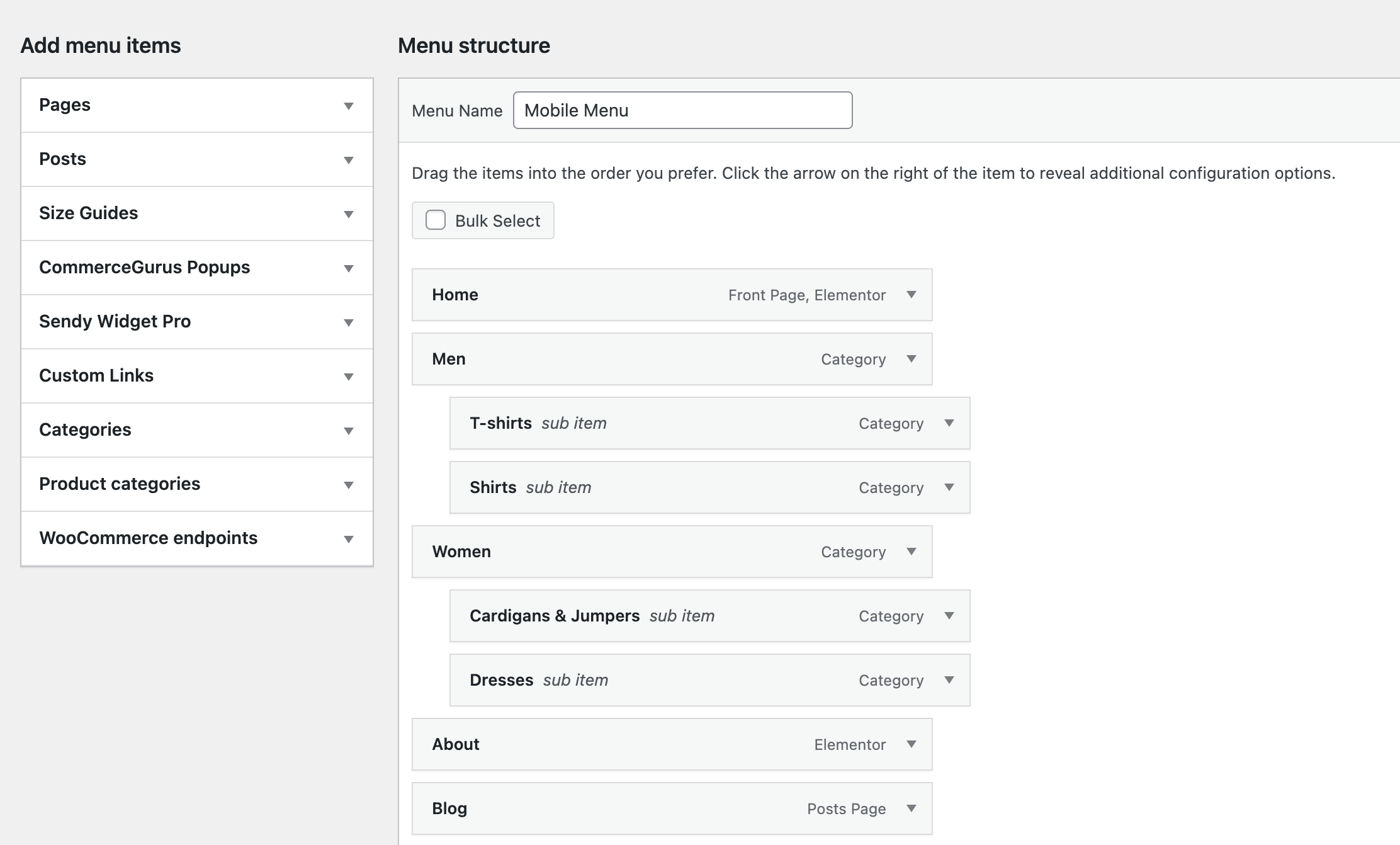
Shoptimizer now includes the option to create a separate mobile-only menu. This is distinct from the standard desktop menu, and may be useful if you want to reduce the number of top level links you want to display to users on smaller devices.
This can also help prevent users from being overwhelmed and to “narrow the funnel” to direct them towards more suitable categories.
1. Create a new menu

Within Appearance > Menus and create a new menu from scratch. I recommend you name it Mobile Menu to prevent any confusion.
2. Add links to it

Next, add the links you wish to display into your newly created menu.
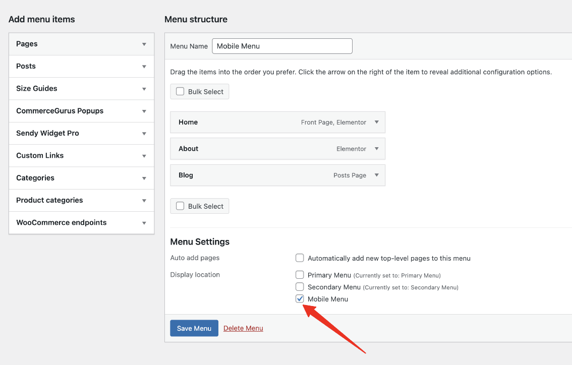
3. Assign it as “Mobile Menu”

Finally at the end, you will need to tick the Mobile Menu checkbox to assign it to be your mobile only menu.


