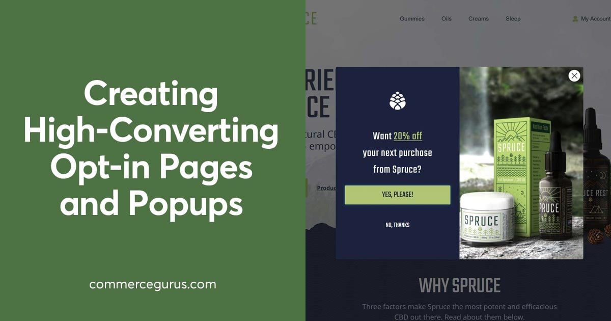
- Tailoring opt-in pages and popups to your audience improves conversion rates.
- Popup and opt-in pages must look good but also include the right elements.
- Experimenting with different types of popups can pay off.
- Using different triggers and display rules will improve conversion rates.
Adding opt-in pages and popups to your site or store can be hugely beneficial for your business.
As the names suggest, they’re often used to get visitors to opt-in to some kind of offer or opportunity. The most common is to opt-in or subscribe to an email marketing list via a form.
However, many other offers and opportunities can be promoted with these opt-in popup forms and pages. Some examples include membership and loyalty programs, complementary products or experiences, subscription services, discounts and promotions, and time-sensitive offers.
Adding a special page to your site that’s designed to get visitors to opt-in to some kind of opportunity or creating popups that display offers while visitors are browsing your site is something you should definitely consider.
In this guide to creating high-converting opt-in pages and popups, we cover how you can add these elements to your site, what you can use them for, and how to ensure you get the most from them.
How to Create High-Converting Opt-in Pages and Popups
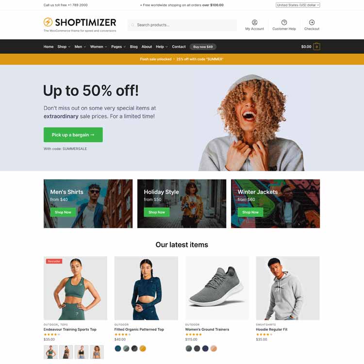
When it comes to adding opt-in pages and popups to your site, you have a few options.
Sometimes, websites and online stores include the necessary functionality and templates to create high-converting opt-in pages and popups quickly.
If that’s the case for you, great! You can start creating these types of assets right away — keep reading to find out how.
If your site doesn’t already have these features or the ones it does have are lacking, you could remedy this by adding that functionality yourself. Depending on how your site or store was built, for example, with Shopify or WordPress and WooCommerce, you could install an app or a plugin.
If your store was built by hand, then you might have to create the templates and code from scratch or hire someone to do it for you.
If your store was built on a platform like WordPress, then you have plenty of options to choose from to help you start creating high-converting opt-in pages and popups.
For example, the freemium Elementor page builder plugin is an impressive tool for creating custom opt-in pages from scratch or by using its library of templates.
When adding opt-in popups, you might want to check out our built-for-WooCommerce plugin, CommerceGurus Popups.
Regardless of how you plan to add opt-in pages and popups to your site or store, there are some concepts and guidelines you should be aware of. Doing so will increase the chances of creating opt-in pages and popups that will convert against your goals and have a positive impact on your business.
To ensure you get the most from your opt-in pages and popups and prevent them from frustrating your visitors, here’s some advice to consider.
Create Tailored Opt-in Pages and Popups
Do you sell different types of products at your store or have multiple offers at your site?
If so, it’s highly recommended that you create opt-in pages and popups that are optimized for those different products and offers.
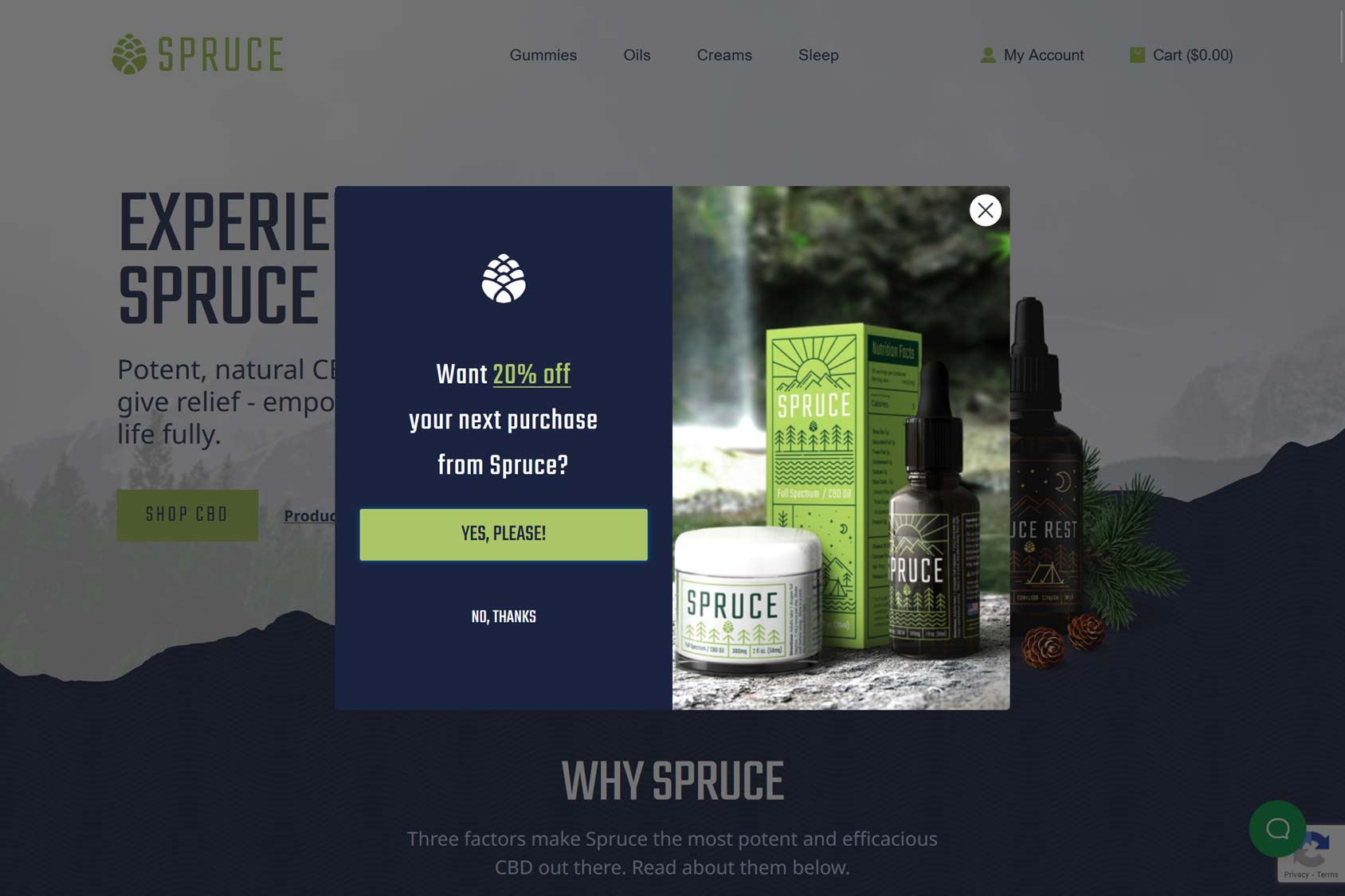
Here are some examples of the different types of opt-in pages and popups you could create…
Upsell and Cross Sell Popups
If you want to generate more cross-sells and upsells, you could create a popup that contains a popular product from a specific category at your store.
You’d then configure that popup so that it’s only displayed on relevant pages. For example,a popup promoting a popular iPhone 15 accessory is only displayed on the iPhone 15 product page at your store.
This is effective as the shopper is considering buying the iPhone. They would see a complementary product displayed in the popup that they then might also want to buy as well.
Tailored Lead Magnets
You could do the same with an email opt-in popup form that contains a lead magnet or freebie, such as a PDF guide or eBook that’s used to persuade the visitor to sign up. The lead magnet would be related to the page the visitor is viewing.
For example, if your site contains tourist guides to different countries, the popup displayed on the guide to Canada would offer visitors a free PDF covering the top 10 attractions in Canada. As the lead magnet is highly related to the content they’re viewing, they’re more likely to optin.
New Customer Only Offers
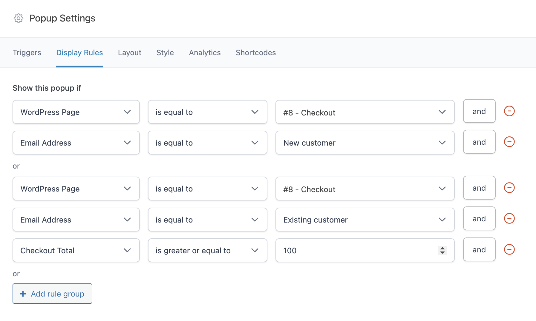
Another option is to use display rules to show a popup only to new customers or people who haven’t ordered from your store before.
This popup could have a welcome offer tailored to new customers. The goal would be to encourage them to make their first purchase. Such an offer could be a discount on their initial order or a free gift.
Opt-In Pages for Different Offers and Audiences
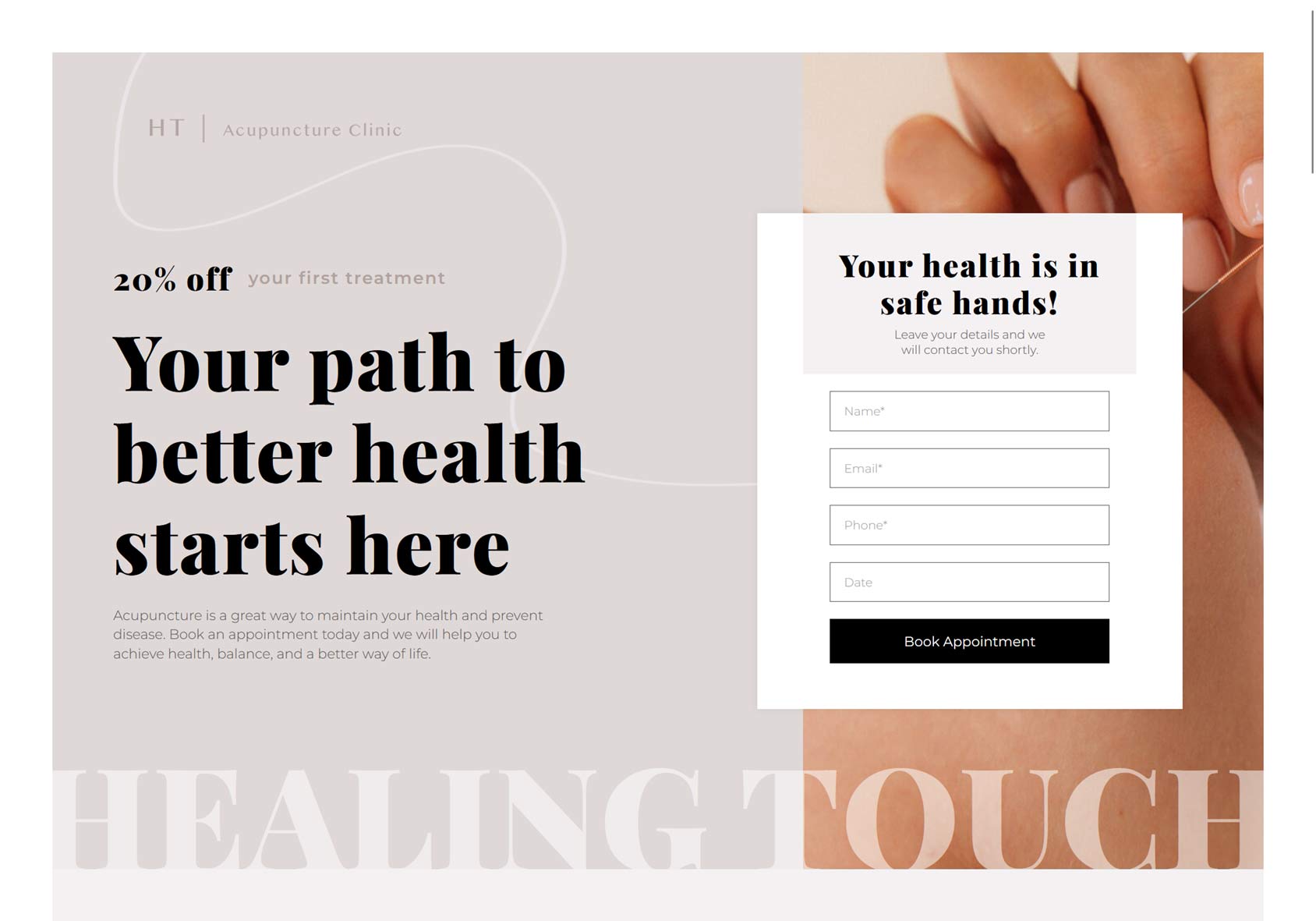
When it comes to opt-in pages, creating a page for each offer at your store makes sense.
For example, if you run webinars on different topics, instead of simply linking to a registration form, create a landing page that’s built with the sole purpose of encouraging visitors to opt-in to that event.
You could take this further by creating multiple opt-in pages for the same offer. In this case, each opt-in page would be optimized for a different segment of your audience.
For example, if you’re selling a fitness program or coaching service, you could create one opt-in page optimized for men and one for women.
The same approach could be taken with traffic sources. If a visitor comes to your site by following a link in one of your YouTube videos, the opt-in page they’re taken to could include a sales video, as that’s a format they’re already comfortable with. A referral from Twitter/X might prefer a more text-based opt-in page.
Creating multiple opt-in pages and popups might seem like a lot of work. However, this approach should yield better results than creating generic assets and deploying them all over your site.
Also, you don’t have to create all of them today. Start small by creating one tailored opt-in popup or page. Then, slowly start adding more to your store.
Opt-in Page and Popup Design
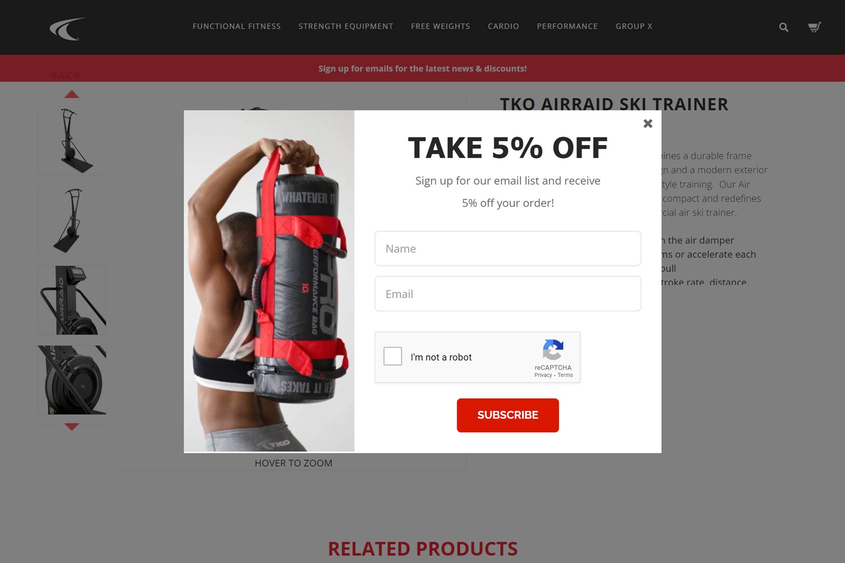
Design is key when it comes to creating effective popups and opt-in pages.
But they not only have to look good they must also include the necessary elements that will drive conversions.
Thankfully, the best popup tools and opt-in page builders make it easy to create high-quality assets for your site. When choosing a tool, look for one with a user-friendly interface and a selection of well-designed templates.
There are also design best practices you can follow to help you get the best results:
- Ensure opt-in popups and pages match your branding and feel like part of your site to deliver a consistent user experience.
- Where appropriate, use images and videos to explain the offer and connect with your audience.
- Add testimonials and reviews to your opt-in pages to convey social proof to your visitors.
- Avoid confusing and overwhelming visitors by clearly indicating the desired action, such as signing up, clicking a button, or following a link.
- Create targeted offers that match where the visitor is in their journey for increased opt-in rates.
- Ensure opt-in popup forms and pages are mobile-friendly and accessible to cater to all of your visitors.
- Use clear “close” and “no” buttons to avoid a negative user experience and make it easy for visitors to decline.
Experiment With Different Popup Types
Depending on the popup functionality at your disposal, you might be able to create different types of popups.
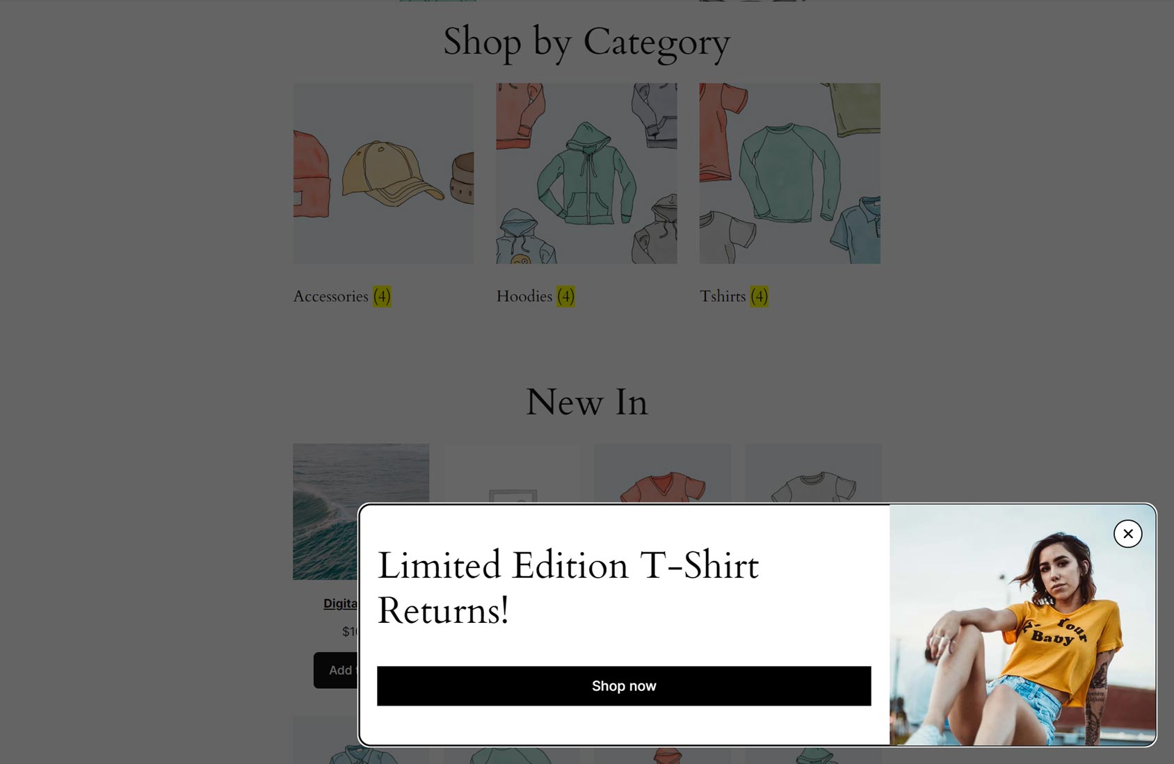
Some examples include the familiar lightbox overlay popup, the corner-placed slide-in popup, and the full-screen popup or welcome mat.
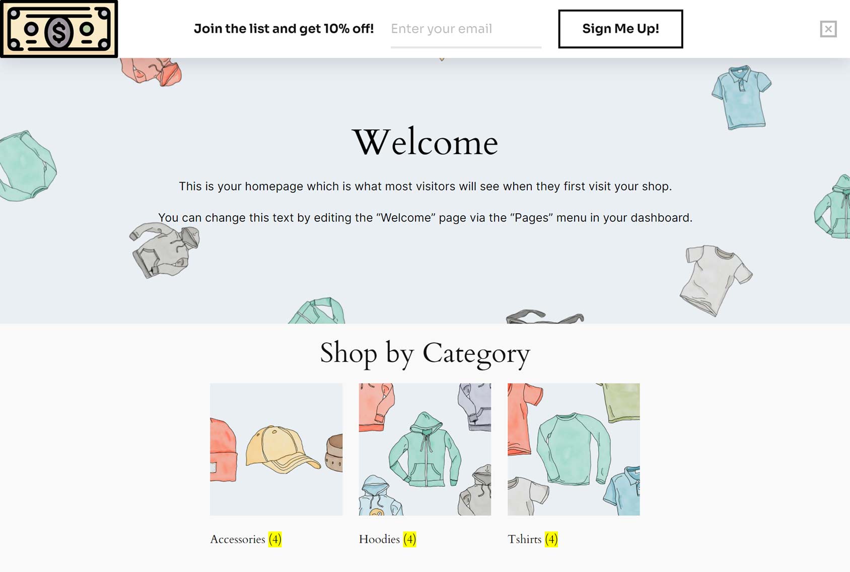
Another option is a popup bar displayed as a horizontal banner at the top or bottom of the browser window.
There are no hard and fast rules covering which types of popups to use and when.
However, the full-screen popup or welcome mat can be seen as the most disruptive and, therefore, should be used sparingly. It’s best used for your most important goals, such as trying to prevent a valuable cart from being abandoned.
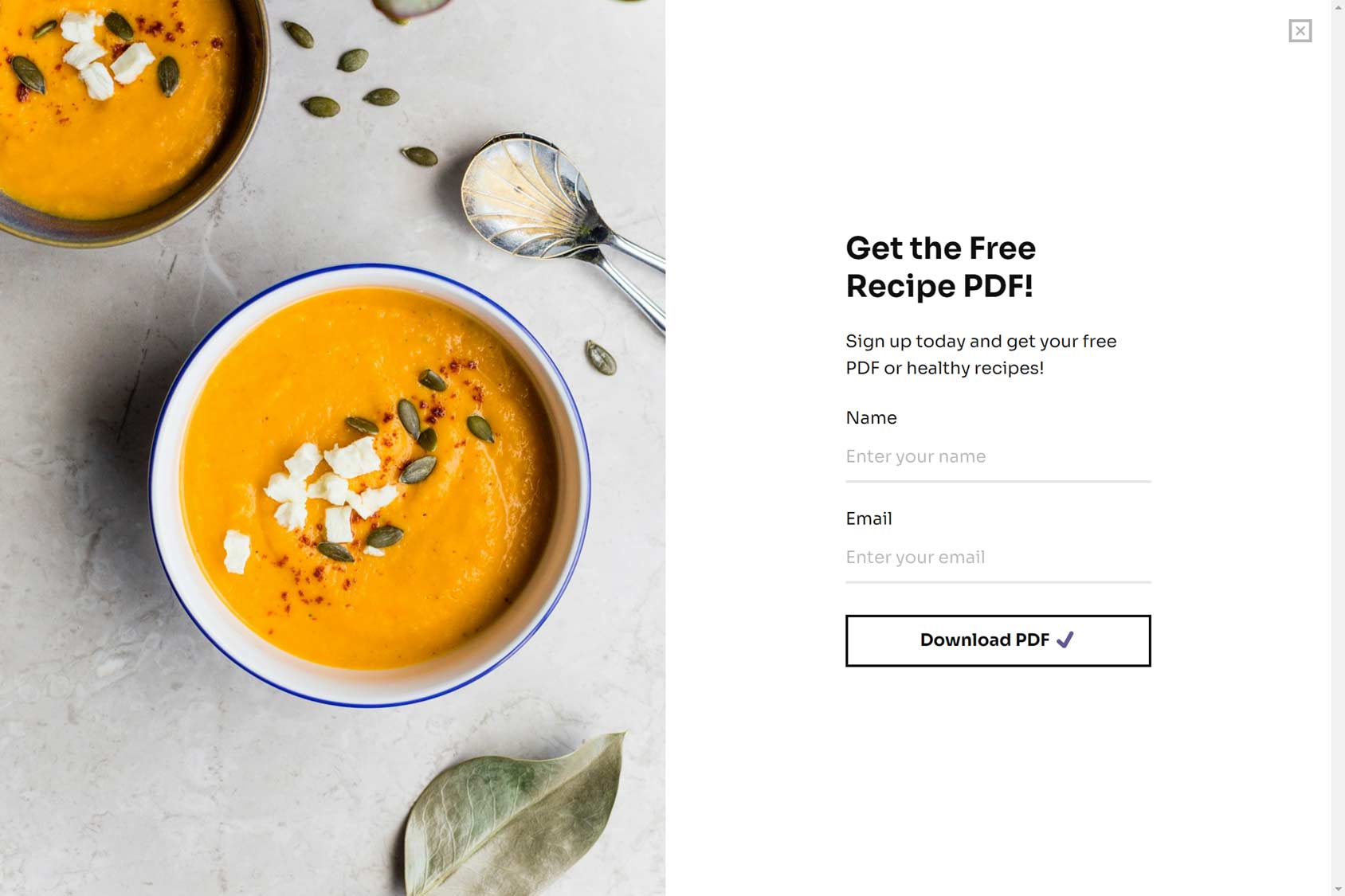
At the other end of the spectrum, a horizontal banner popup is the least disruptive. They typically “push” the page content down rather than obscuring it. These popups could be used for less critical situations, such as displaying a timer counting down to when a promotion ends, a promotional message, or a generic email opt-in form for your newsletter.
Mixing up the types of popups you use at your store could prevent visitors from automatically closing them as soon as they’re displayed. The novelty of seeing a popup slide in from the bottom right corner on one page and then seeing a different popup displayed as a banner on another page could make your offers more engaging and harder to ignore.
You can also use different animation effects in conjunction with different popup types to ensure you catch the attention of your visitors. However, less is more when it comes to these types of effects, with subtle effects being less annoying than over-the-top animations.
Use a Wide Range of Triggers and Display Rules
Once you’ve created some opt-in popups, you can use advanced triggers and display rules to control when and where they’re displayed.
Exit Intent Trigger
Depending on the features available to you, you could use the exit intent trigger to display a popup when a visitor is about to leave your site.
This popup could contain an offer designed to encourage the visitor to make a purchase rather than leave your site. A common exit intent popup offer is a money-off coupon code.
Dwell Trigger
If you have access to a dwell intent trigger, you could use it in a similar way.
This type of trigger can detect if a visitor is inactive or dwelling on certain parts of your store, such as the checkout page.
This lack of activity could be interpreted as the visitor having second thoughts about completing their order. Once the visitor’s hesitation is detected, a popup with an offer that could overcome that hesitation is displayed.
Combining Triggers and Display Rules
Combining these triggers with carefully selected display rules will help you get better results from your popups.
As display rules let you control which pages or parts of your site individual popups are shown on, you can ensure that the popup content is highly relevant to where the visitor is in their journey.
For example, if the shopper is viewing a product page, the popup displayed could contain additional information, such as a video or an offer related to that product.
Another type of display rule lets you display a popup depending on the cart total. For example, if the shopping cart total is over $200, a popup would be displayed that contains an offer optimized for converting that type of order, such as free shipping or a percentage discount.
For carts with a lower total, you might not want to display an offer at all or one that’s less generous.
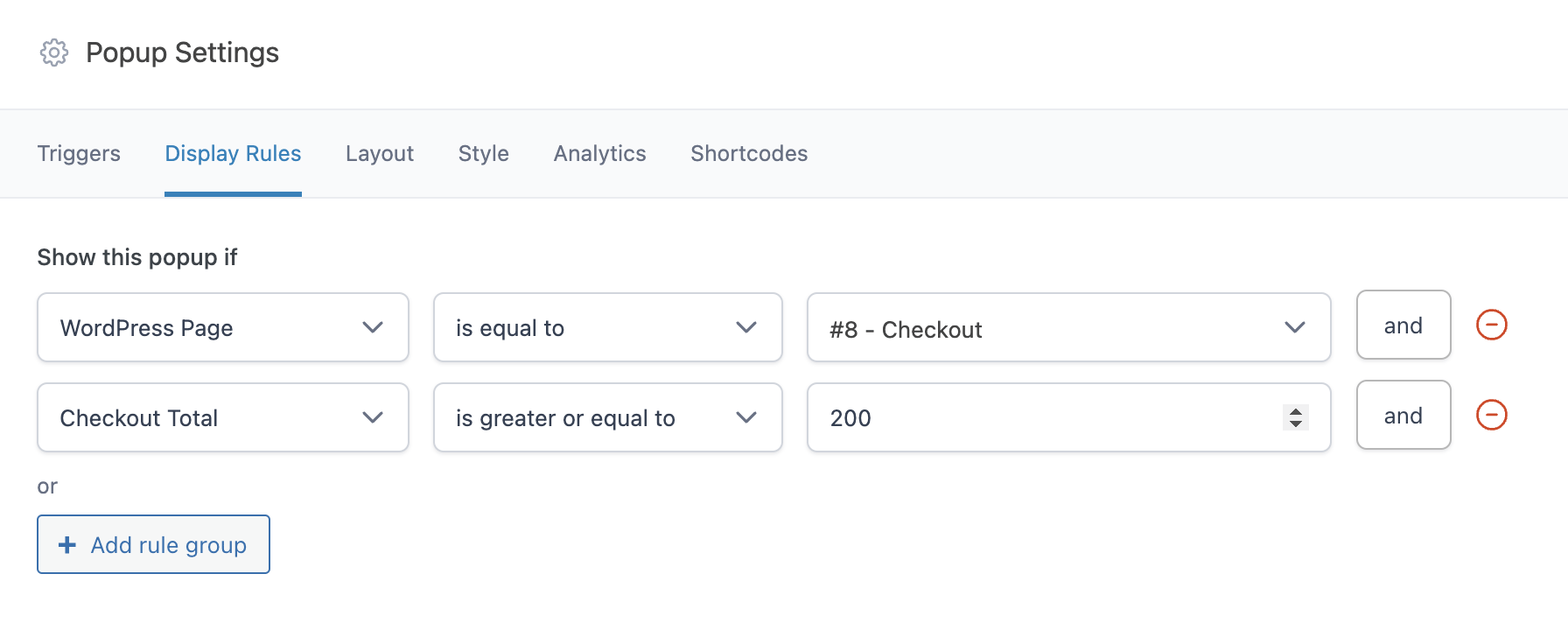
As you can see, advanced triggers, such as the dwell and exit intent triggers, give you more ways to generate sales that might otherwise have been lost.
Measure and Test
Once you start adding opt-in popups and pages to your site, it’s important to start measuring their performance.
While popups can definitely benefit a site, they can also cause problems if not deployed in a way that resonates with your audience.
For example, too many popups, popups that can’t be easily closed, or overly aggressive opt-in pages can turn away potential customers.
Due to this, it’s vital that you measure the impact of your popups and opt-in pages and adjust them to ensure they’re helping rather than harming your site.
To do this, some tools have their own analytics features, monitoring impressions and clicks. But even if your choice of tool doesn’t, you can still measure the performance of your popups and page by tracking changes in email subscriber rates and other metrics, such as new customer sign-ups, sales, and average order value.
If you can implement A/B testing — showing one version of a popup or page to a segment of your audience and another version to the rest — you can run experiments to optimize your assets for the best results.
Summary
Hopefully, you now have the motivation and knowledge to start creating high-converting opt-in pages and popups for your site or store.
Creating multiple popups and opt-in pages, each tailored to different outcomes and audiences will help you to get better results than deploying generic ones.
Following the best popup and opt-in page design practices will increase your chances of success while experimenting with different display rules and triggers will enable you to come up with creative ways to display your offers.
Finally, remember to monitor how your popups and pages are performing. Don’t just set and forget; instead, experiment and optimize to get the best results.

