
Sliders or carousels used to be ubiquitous on the web, especially on eCommerce websites. In 2015 Baymard reported that 52% of stores used one on their homepage. In recent years however we’ve seen a shift away from sliders, and for good reasons. Let’s investigate why.
Firstly, why are image sliders so popular?
Two reasons here I think. First, is that some owners think they look “cool”. Impressive transitions and graphics flying in are a sure way to impress a site owner without thinking of loading speeds or the actual conversions which results.
The second is politics. It was always used as a way to keep multiple stakeholders happy by giving everyone a piece of homepage real estate. Need to feature a special offer within a department somewhere? Just stick it as an extra slide. The analytics are rarely analyzed which shows that very few people wait around for a later slide to even appear.
What does research say?
Jacob’s Nielsen covered image sliders back in 2003 in an article called “Auto-Forwarding Carousels and Accordions Annoy Users and Reduce Visibility” which is quite self-explanatory by itself.
In an example using Siemen’s homepage, a usability test concluded that visitors missed the special deal on a washing machine due to banner blindness and the movement of the slider. He concluded:
“The worst offense is probably in making something move that should be static”
Reasons why image sliders are detrimental
The problems with animated image sliders are numerous. Firstly, they add an enormous amount of extra weight to a page – with huge, bandwidth sucking images, javascript, and additional CSS files. These extra requests have a hugely negative impact on page speed, especially on mobiles accessing your store on a cellular network.
A heavier page weight results in worse SEO scores – Google in 2018 are putting an enormous emphasis on mobile-first performance and sliders are a major problem when it comes to this. When visitors get frustrated with a slow-loading site they leave, which increases your bounce-rate – which causes a fall in organic SEO rankings. Plus, a slider has the natural effect of push your key content further down the viewport, reducing its effectiveness and SEO performance.
The click-through rate is extremely poor. In a study of the University of Notre Dame’s homepage with 3.7 million visits over 6 months – only 1% of visitors clicked on any link within the slider.
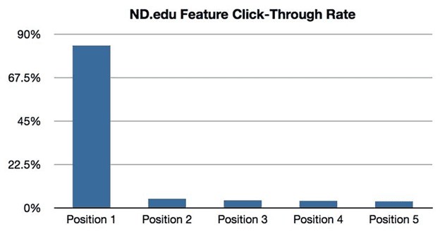
Interestingly out of the people who did click, 84% were on the first slide. So with a very low conversion rate in the first place, virtually everyone ignored the subsequent slides.
Why not just use a static homepage feature with data like this?
The solution: a hero layout
Despite virtually all ThemeForest WooCommerce themes coming with a slider, almost by default, we are seeing some very different approaches taken by major eCommerce retailers, who are of course, far more interested in conversions and cold hard cash.
What they have in common is the emerging trend of the hero layout – a single, simple image with a clear message and a call to action button which doesn’t suddenly move out of your eye line. Furthermore, it’ll load quicker, without all of the excess javascript and images nobody sticks around to see and it doesn’t suffer from the banner blindness associated with moving elements.
Asos
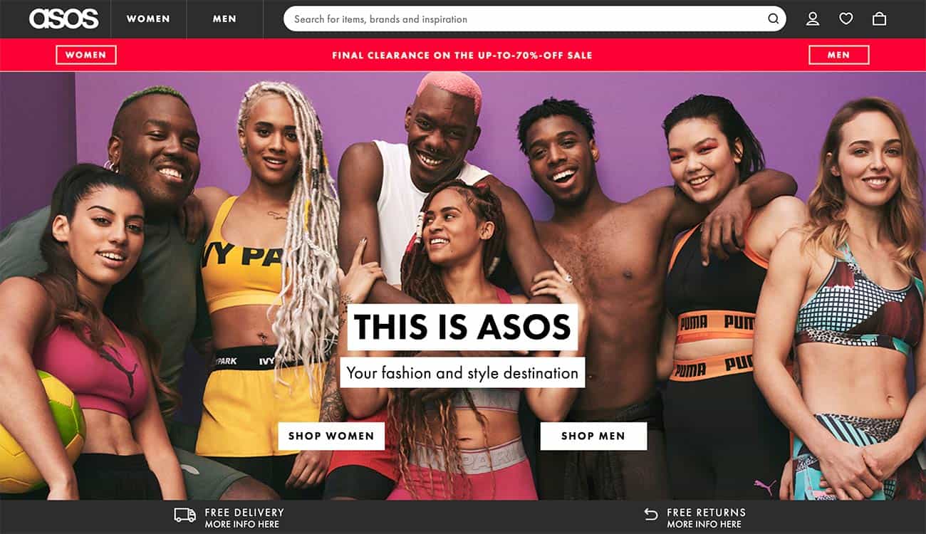
One of the biggest retailers in the world, ASOS uses a hero image on its homepage, with a clear message “Your fashion and style destination” and two call-to-action buttons to its Men and Women categories. Free Delivery and free returns are also emphasized in the bar beneath.
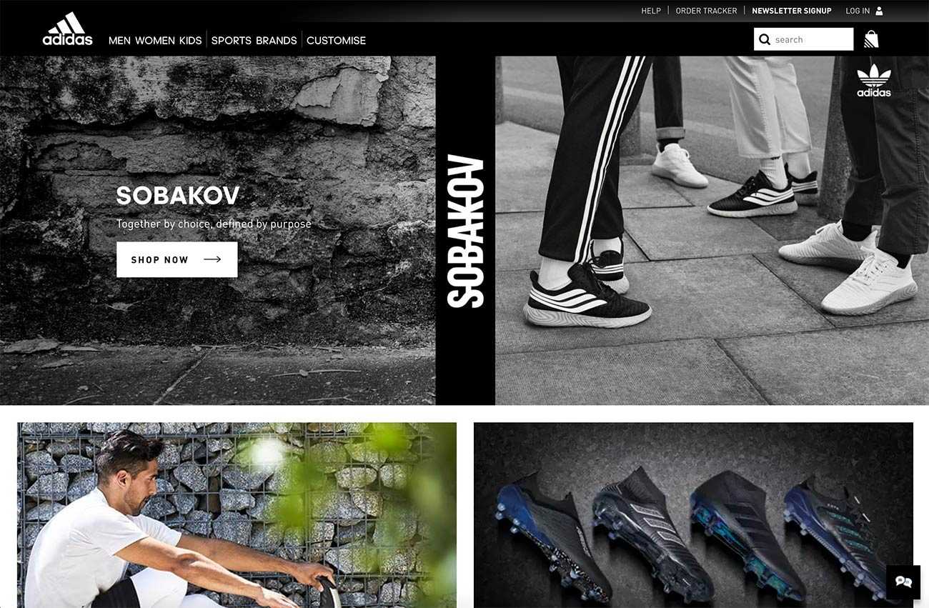
German fashion retailer Adidas uses its current hero image to promote its Sobakov range of trainers. With no distracting slideshow it’s very clear what the primary focus of the page is. Once again, a straightforward tagline and shop now button is used.
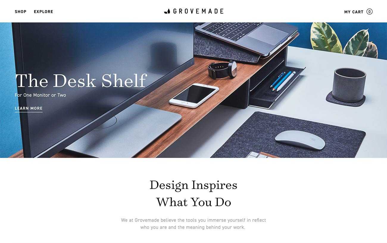
Grovemade’s hero image displays its desk shelf prominently with a clean, non-cluttered focus, reflecting the products themselves. Because the hero image takes less space, their ‘Design Inspires What You Do’ tagline is also prominent, further instilling its company ethos to visitors.
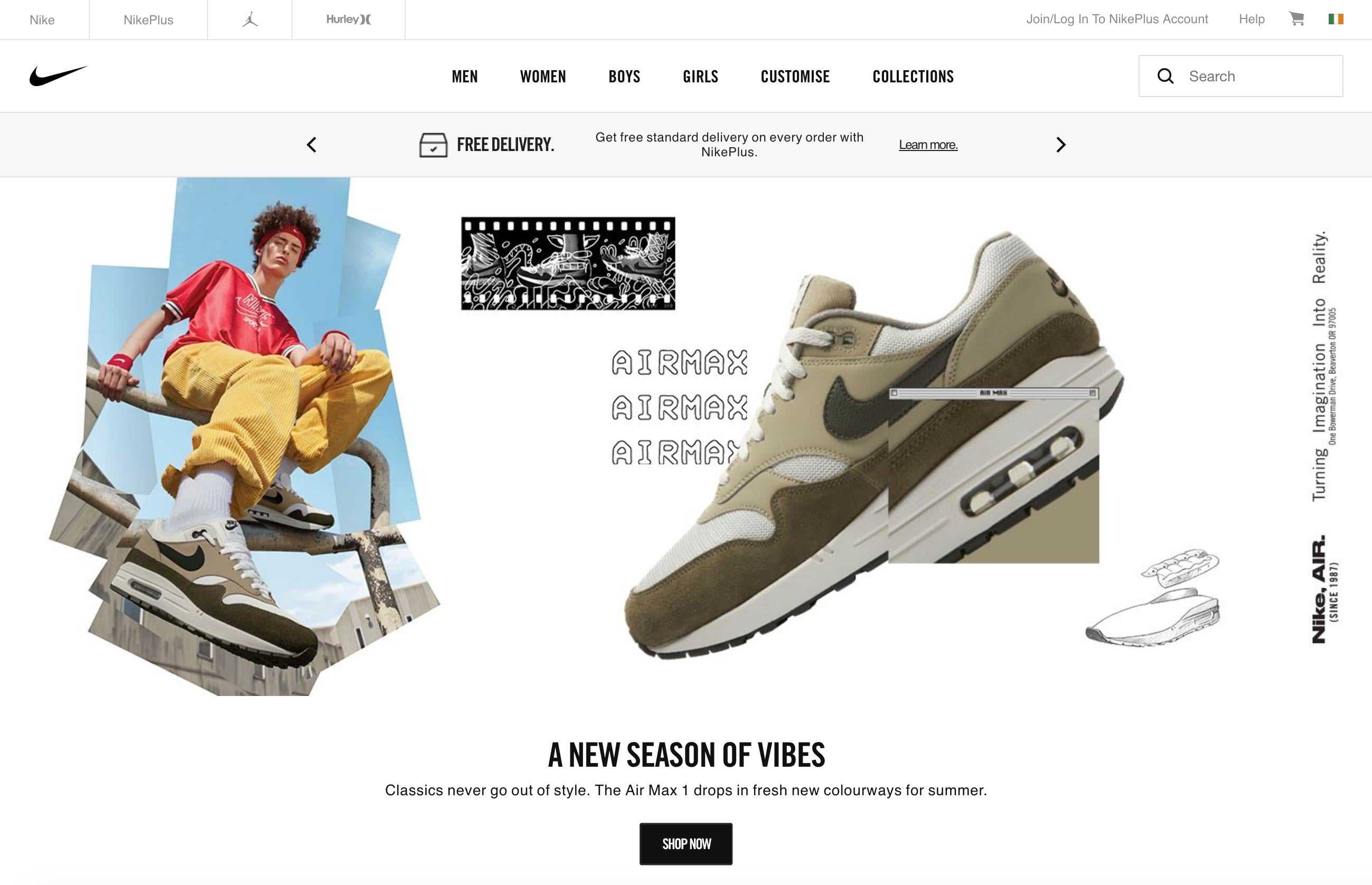
Nike uses a funky montage within its hero shot, focusing on its new Air Max 1 range. It shows that it doesn’t need to be a static photograph to create a unique feel. I particularly liked the early 90’s style Mac browser window as a type of product zoom to examine the detail. A clear message and call to action button is utilized so that there is no confusion regarding the current focus.
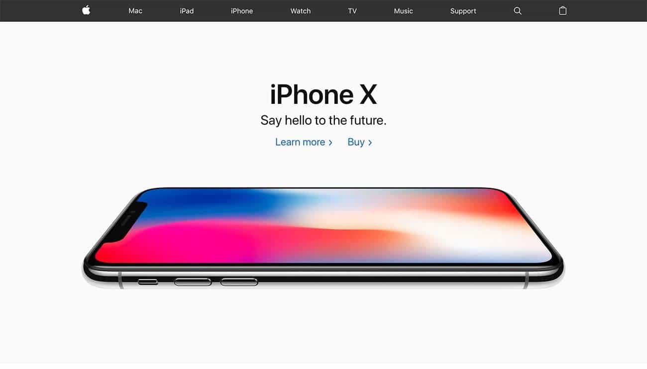
Probably the earliest proponent of this hero shot was Apple and their design is as product-focused as it gets. With a stylish image of their iPhone X and a smart tagline it’s an excellent example of a hero feature. One additional simple touch is that the link colors are a traditional blue with a small arrow.
Shoptimizer WooCommerce Theme
So, due to speed, conversion-ability, and SEO, our Shoptimizer WooCommerce theme uses a hero layout on its homepage rather than a slider. We wanted to take all of these lessons learned and apply them to make the best WooCommerce theme available.
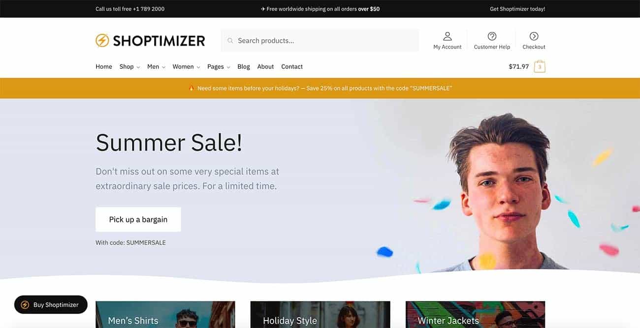
We’re using the excellent Elementor page builder to create our hero shot – a simple image focus – with a strong tagline focusing on a sale and a call to action button. You can use this to create almost any kind of hero layout including the examples used in the screenshots above. Stay tuned for additional hero layouts within Shoptimizer’s demo data which you can easily reuse.
In conclusion
Don’t add an image slider to your site just because it’s the most convenient option. Think about what product or service you want to direct visitors towards and focus on just that. Pick a single action and direct all of your customer’s attention on it – secondary actions can be placed below. Remember, your site is unique so don’t just blindly imitate a competitor. Be aware of your own data on what item is the most high-converting and emphasize it above all others.
Finally, measure your results! Google analytics makes it easy to do so. So test your outcomes and find what hero image and copy works best.
If you want our high-converting, super fast WooCommerce theme with outstanding support and regular updates, Shoptimizer, use the code HERO for 10% off!


 The Importance of Product Filters in eCommerce
 17 Product Page Best Practices (with examples)
 Speed up Loading Times with EWWW Image Optimizer
 Best Order Confirmation eCommerce Examples