We’re thrilled to announce the arrival of Shoptimizer 2.5 which includes version 2.0 of our CommerceKit plugin – the all-on-one conversion solution for your WooCommerce store.
This is a major new update and forms a key part of making Shoptimizer the de-facto tool to create a world class eCommerce store with WooCommerce.
This update includes features which ordinarily would require the purchase of multiple plugins, costing hundreds of dollars. Instead, they’re all in this feature-packed update! We’ve wrapped an incredible amount of functionality within Shoptimizer and CommerceKit. We think it’s a game-changer when it comes to WooCommerce.
There are a lot of new features to discuss so let’s get started!
Let’s look at leading brands’ product pages
Before we begin, it’s worthwhile to step-back from WooCommerce as a platform and look at the broader picture. Product pages have come a long way in the past couple of years and we can learn a lot by looking at the websites of major eCommerce companies.
There are some key commonalities in the examples I’m going to show.
- No sidebar. There are no distractions from the product being displayed, so no sidebar is displayed. The product almost always takes up the full width of the container.
- Big images. The product’s gallery usually takes up 50%-70% of the screen real-estate. High resolution, professional photos are a crucial component of creating conversion-optimized product pages on eCommerce stores.
- Grid layout for the gallery. Displaying product images in a grid on desktops allows the customer to see more of the item at a glance. Whereas a traditional carousel requires a user to click through each slide, a grid of multiple photos provides a much more scannable overview of the product. The grid converts into a carousel on smaller screens as there simply isn’t the same amount of real-estate on mobile devices.
- Autoplaying video. Some of these examples include autoplaying embedded video within the gallery. This adds even more dynamism, as the eye is drawn to movement. Seeing a product you’re interested in playing in a video helps establish credibility and build consumer confidence.
- Visual swatches. Using images, colors, or button labels is a far superior method to display variations. At a glance, a customer can see the different options. They may not be aware of the varieties available when this key information is hidden within a dropdown.
- Position of key elements. Ensuring that the variable selections and the add to cart button is as far up the viewport as possible increases their importance and encourages interaction. Short description text is of lesser importance and can be placed beneath these elements.
Gymshark
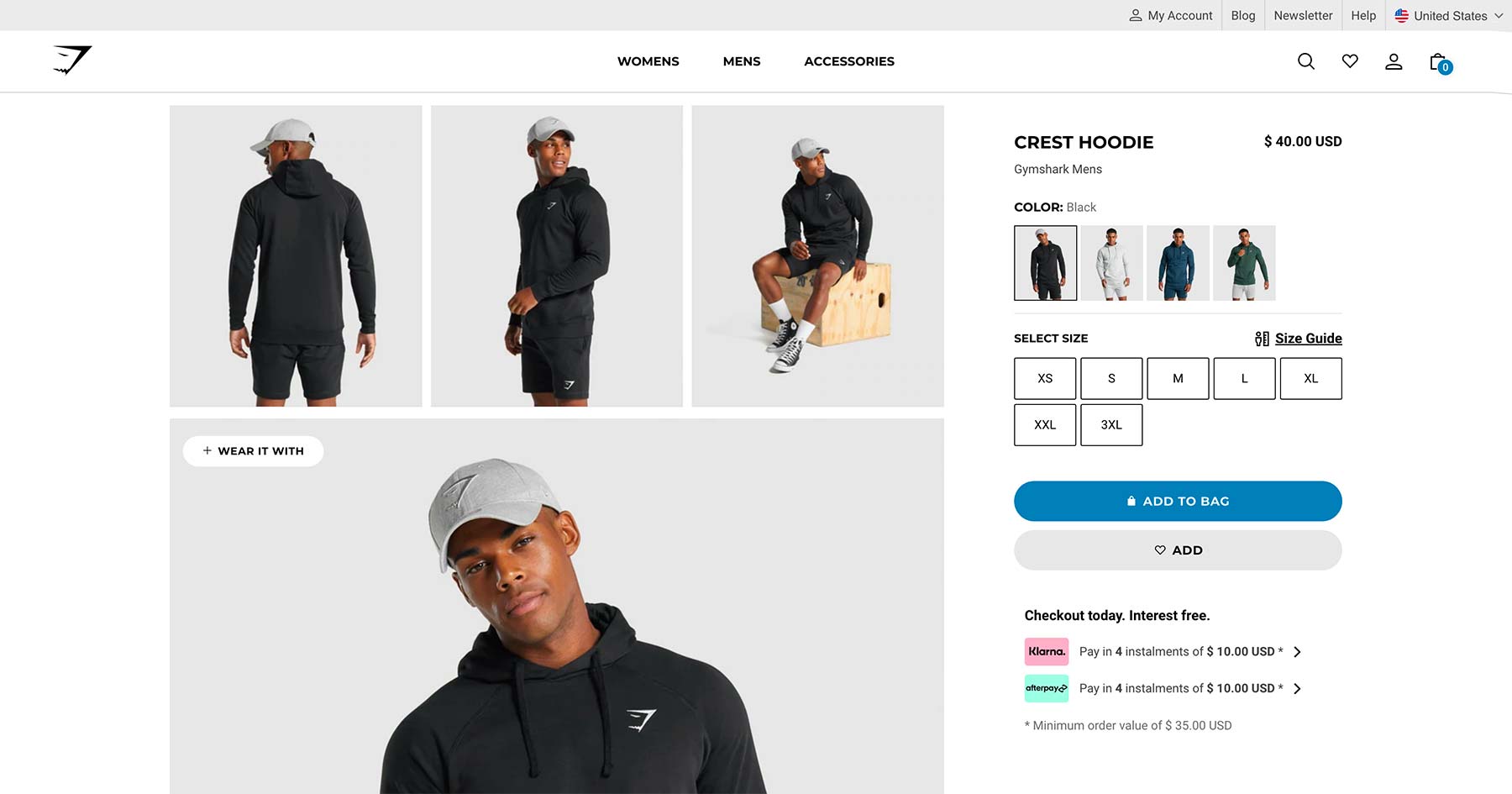
Gymshark’s product pages are an excellent example of these criteria. With a wide grid of product shots, and large clear swatch thumbnails, it’s a modern, clean example of how this key template should be displayed.
Everlane
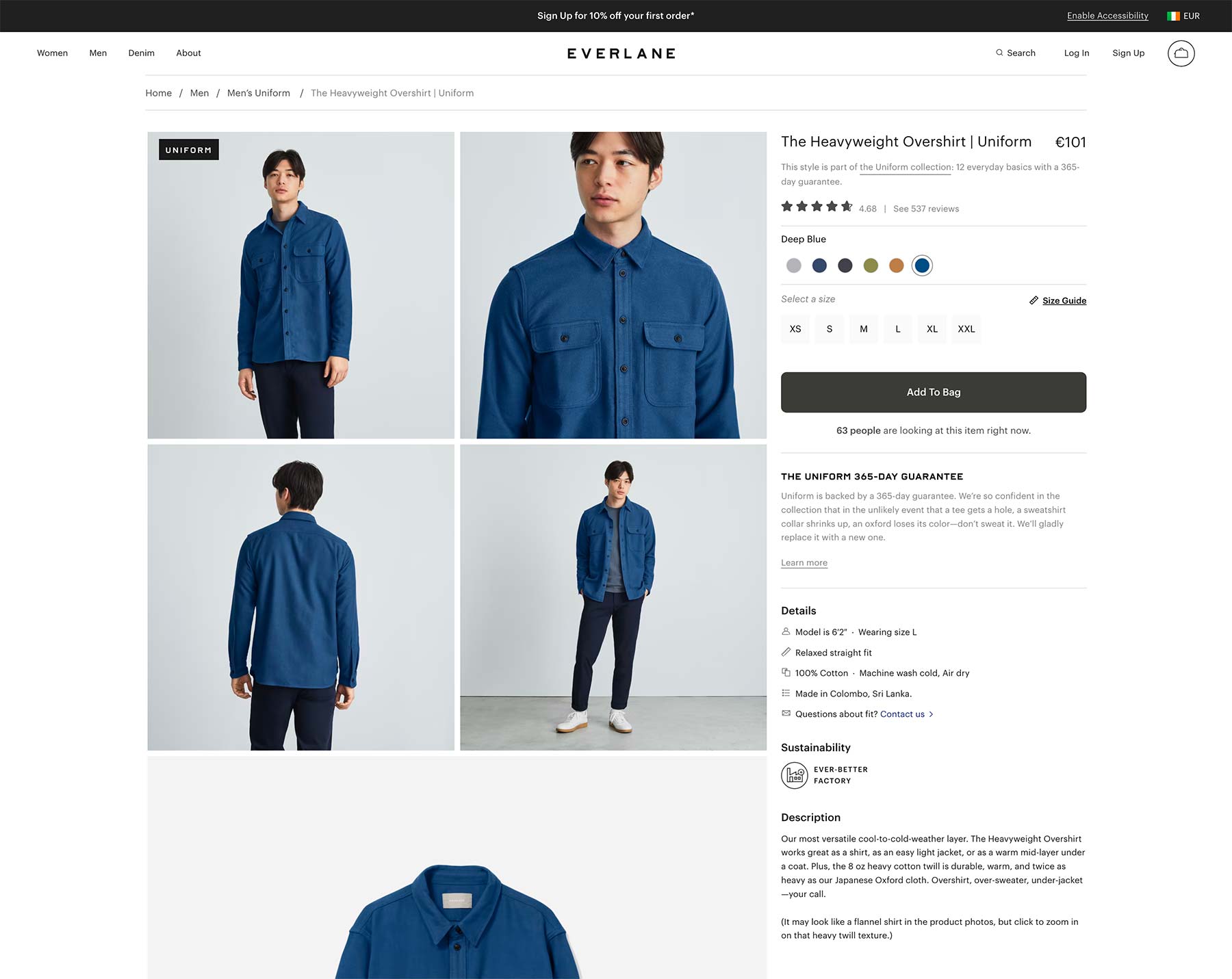
One of the biggest online clothing brands, Everlane’s product pages are as stylish as their products. Some of the product grids include autoplaying video too.
Nike
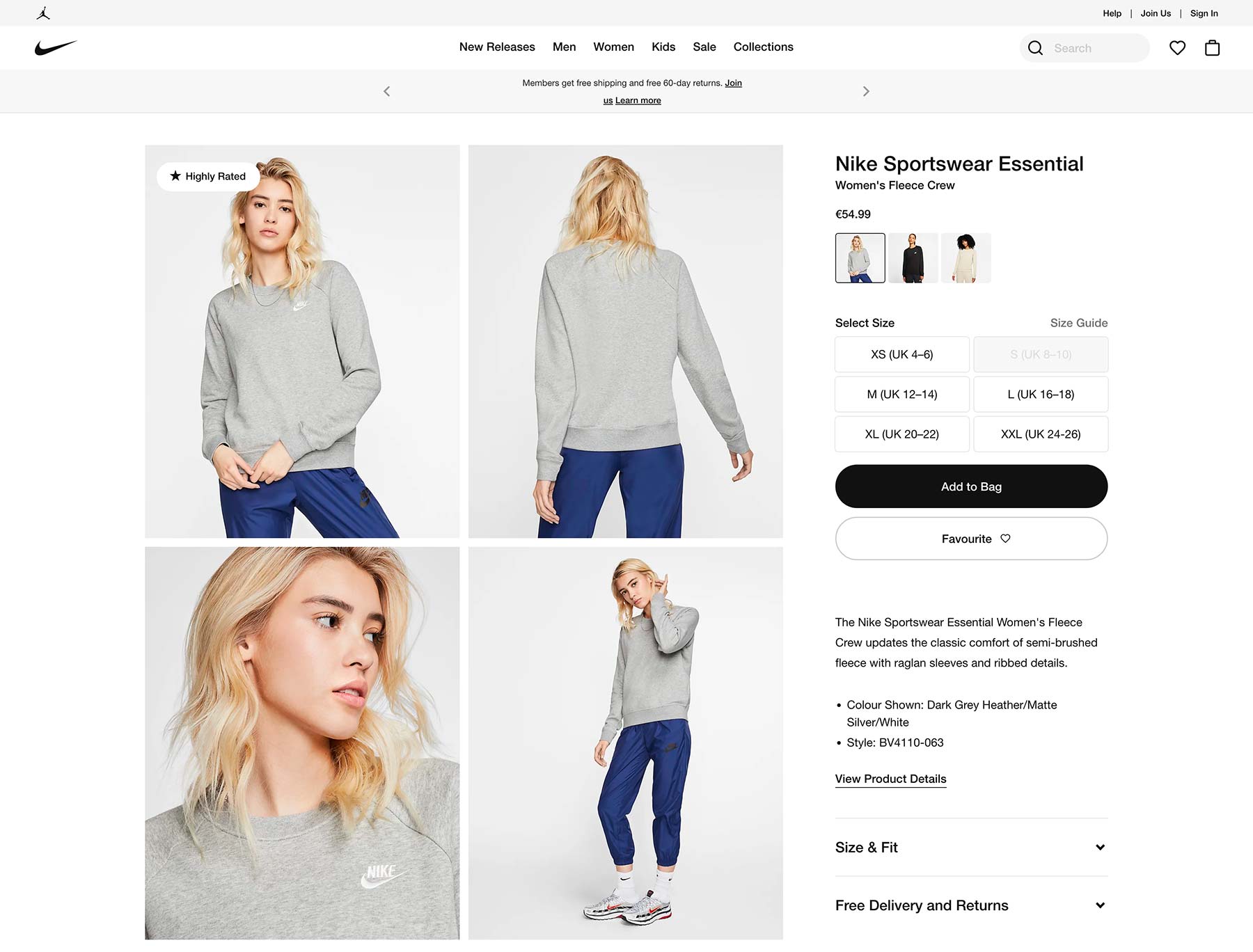
Nike’s single product page layout captures all of these elements also, apart from including inline video within the product grids. I liked the large size selectors which are very easy to click or tap. The overall look is very clean. By avoiding any strong color apart from shades of black, the gallery images seem to pop even more.
Introducing the new Shoptimizer product page
So, after reviewing these and many many others, we wanted to include the capability of creating something very similar to these top eCommerce brands in our Shoptimizer WooCommerce theme. And I think we’ve haven’t just matched these top eCommerce sites, we’ve exceeded them.
The product page screenshot below an example of what you can now create in Shoptimizer. Take a look at the direct link to this particular variable product to fully experience the result. We hope you’re blown away by what you can now accomplish with the theme!
Let’s go though each numbered point on the image.
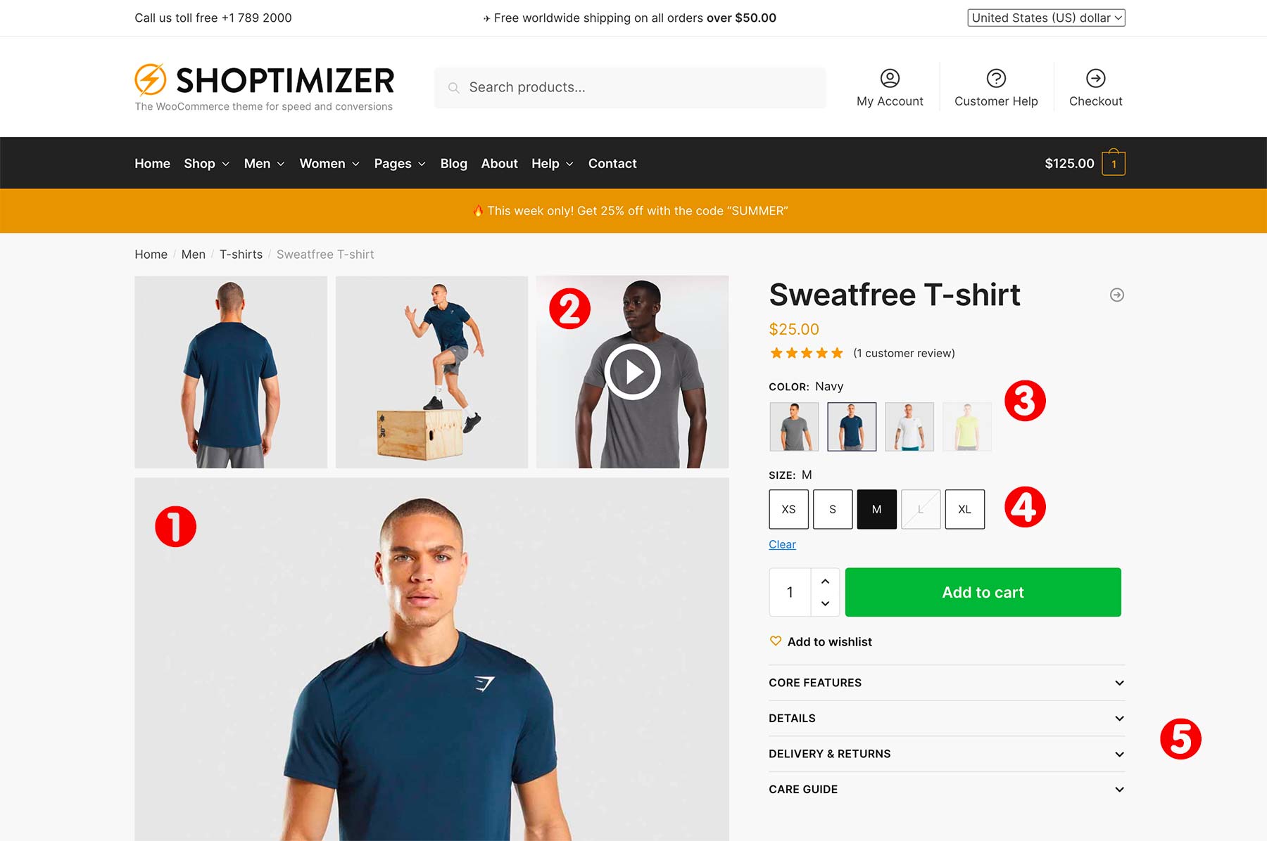
1: Grid Gallery
The first and most prominent new feature is the new grid gallery. CommerceKit now includes three new grid gallery layouts you can choose from.
- Grid: 2 cols x 4 rows
- Grid: 3 cols, 1 col, 2 cols
- Grid: 1 col, 2 cols, 2 cols
These options reside within CommerceKit’s Product Gallery feature. You can set up a product grid layout in two ways. The first option to set the grid as the global gallery layout. This means that all of your products will take the layout.
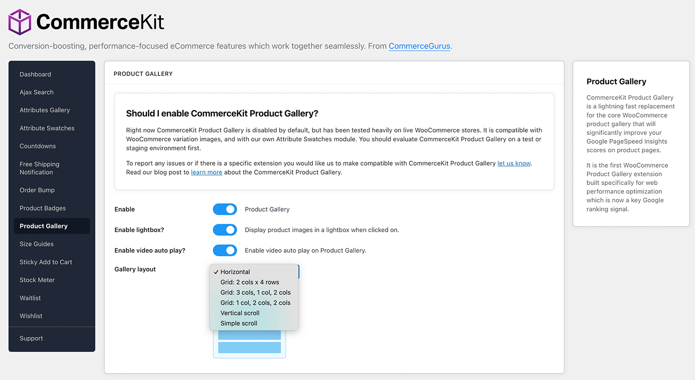
Or, you can edit a particular product and you’ll see a Product gallery layout dropdown within the CommerceKit options sections on the right-hand side.
These grid layouts are an excellent way to display product images. Furthermore, the right-side content area ‘sticks’ to the top of the viewport, which allows a customer to scroll through multiple product images, while key information, such as the product title and price stay visible in the viewport.
If you have many images, a Load more images button appears at the bottom of the gallery grid.
Shoptimizer also now includes a new theme option to make the gallery width wider, so your product images can be made more prominent. You’ll see the option within:
Appearance > Customize > Layout > WooCommerce > Product gallery width
You can now set this to be Wide, so the gallery takes around 60% of the width.
2: Support for video!
We’re delighted to include the option of embedding video within any of CommerceKit’s Product Gallery layouts. Video is becoming more and more commonplace across major brands’ product pages. Video adds a dynamism to a product which can’t be replicated – even with the best photography.
Crucially, we’ve incorporated video into the CommerceKit Product Gallery feature with web performance in mind. So you’ll still get outstanding Core Web Vitals scores across your product pages.
You can see examples of video autoplaying within the gallery grid below.
To include a video within a gallery hover over a thumbnail and click the little video icon which appears. You’ll then see a video overlay which allows you to select a video to embed. It’s that easy.
You can include video via YouTube and Vimeo urls, but we recommend embedding MP4 files as the best approach. There are various online tools out there to crop a videos to match your product image sizes. That keeps everything looking nice and neat. For example this video cropper works well.
3: Attributes Gallery
CommerceKit now includes an Attributes Gallery which dramatically improves how WooCommerce display variation images.
This is how core WooCommerce works.
Say you have a variable product with two attributes: color and size. You would need to first select a specific color and a specific size. WooCommerce would then update the featured image if you have assigned an image to that exact variation.
This is out-of-line with how cutting-edge eCommerce stores do things.
So we’ve built a powerful Attributes Gallery within CommerceKit. You can build a unique gallery, and attach it to a specific attribute. An example would be the color ‘Green’.
When you select ‘Green’ – the entire gallery updates with a collection of images associated with this attribute. See the video below for an example of how this works!
This is much more user-friendly for visitors. They no longer need to pick an exact variation, and they can see an entire product gallery associated with an attribute, rather than a single image.
4: Attribute Swatches
WooCommerce by default, displays variations as text within a dropdown. This leaves an awful lot to be desired.
In research conducted by Baymard 88% of the top 60 US and EU eCommerce sites have color as an available variation for at least some of the products. Their large-scale mobile usability testing showed that many users overlook color indicators shown in text.
And we know that it is on mobile where most sales now take place.
Displaying available variations as swatches, i.e. images, colors, or labels, avoids the problem of having to first click a dropdown to see the options available.
A major component of this update is the new Attribute Swatches module within CommerceKit. We wanted to bring the huge benefits of swatches, without requiring a separate third-party plugin, all built in an extremely performance-focused way.
We’ve even included the ability to display swatches on product listings pages. More about that shortly.
In the screenshot below, you can see on the left, the default way WooCommerce displays variations. On the right you’ll see the different when the CommerceKit Attribute Swatches module is enabled and configured.
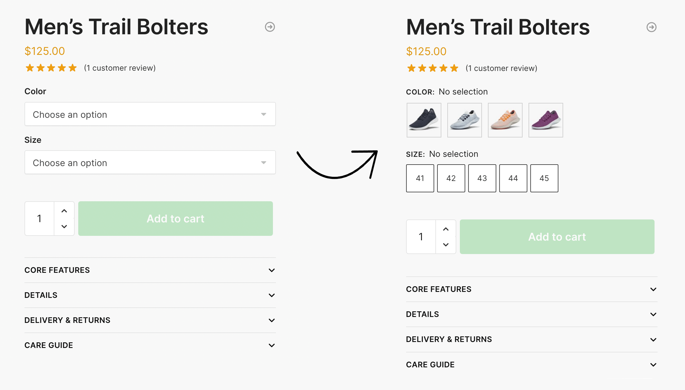
It’s a massive upgrade on how default WooCommerce operates, and it transforms product variation selection into something far faster and more engaging. You can display swatches as images, colors, or labels, depending on your store’s requirements.
Our Attribute Swatches work brilliantly with the Product Gallery and Attributes Gallery features. Inter-compatibility between CommerceKit’s features is a key benefit. Combined, these CommerceKit modules form the perfect toolkit to create world-class product pages.
5: Re-order short description and display an accordion
To complete the look of the product page, we’ve included a number of additional layout options which give you even more control.
Firstly, you can how position the short description area below the quantity and add to cart button. This ensures that the product swatches and the call to action appear as far up the screen as possible. This keeps the customer’s focus on the attribute swatches and the short description text becomes less distracting.
There’s a new metabox when you edit a product which allows you to re-position this short description area. Or, you can move it globally across the entire site via a new configuration option in the customizer. You’ll find it in:
Appearance > Customize > Layout > WooCommerce > Product short description position
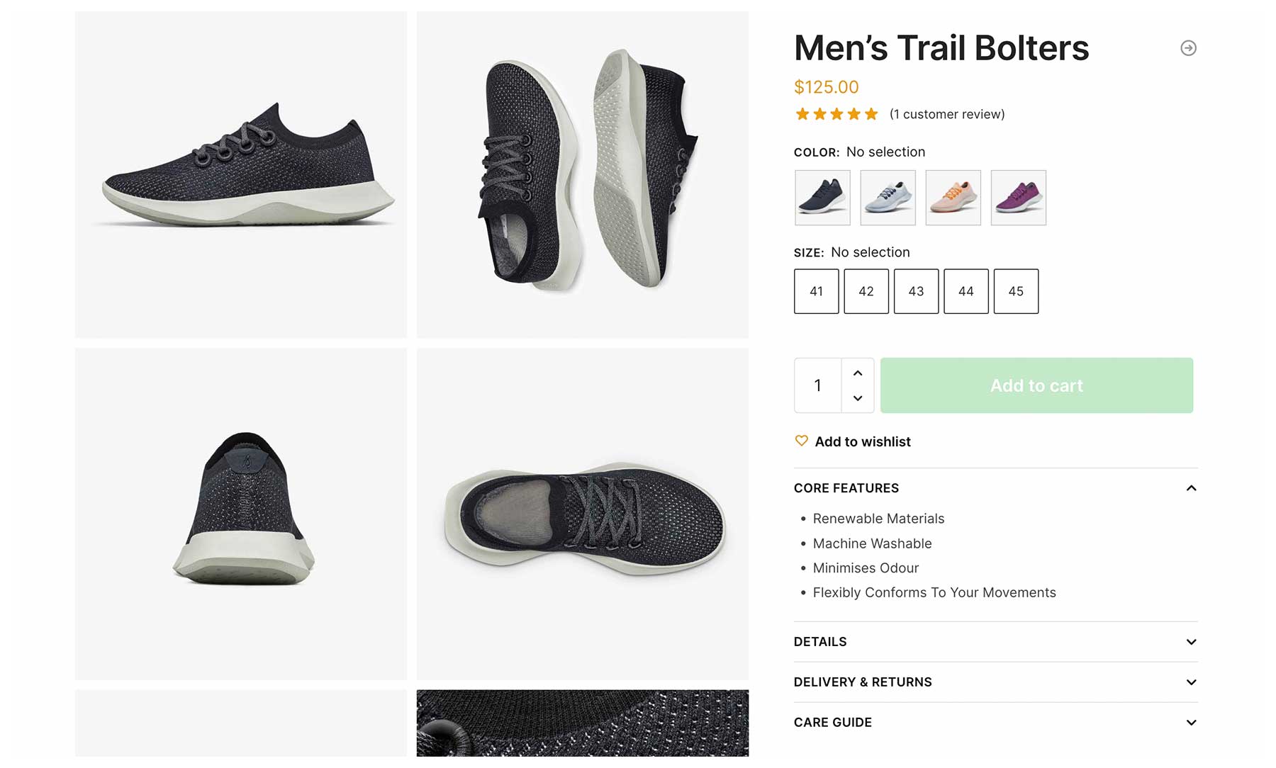
Secondly, we have included the facility to include an accordion within this space. This is becoming a more common pattern on eCommerce sites to include useful content above the fold. But crucially, these content elements are collapsed until the user clicks on it. This flexibility allows a store owner to include valuable data in a prominent position but not have it take up much space.
We built this accordion using the native HTML <details> element and a sprinkling of vanilla javascript. This ensures that the result is fully standards-compliant, lightweight, and accessible.
How top eCommerce stores display listing pages
But our update doesn’t just cover the product page. Let’s look at the product listings page next.
The default WooCommerce listings page lacks the facility to see product variations at a glance. It’s essential for available product variations, such as colors, sizes, and materials to be clearly indicated on this page.
Without variations displayed clearly visible to visitors, conversions suffer. Many customers reject products that fit their requirements simply because they don’t realize that multiple variations of the item were in fact available. They judge the product on the default variation which is displayed, not knowing that many other relevant variations exist, but are only visible on the product page.
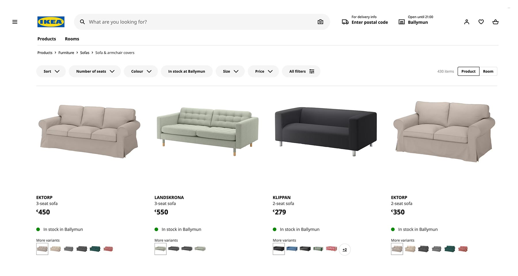
Note how when browsing the Ikea eCommerce store, you can at a glance, see which sofas exists in multiple variations. The image swatches are obvious right on the listings page and the featured image updates when a swatch thumbnail has been clicked on.
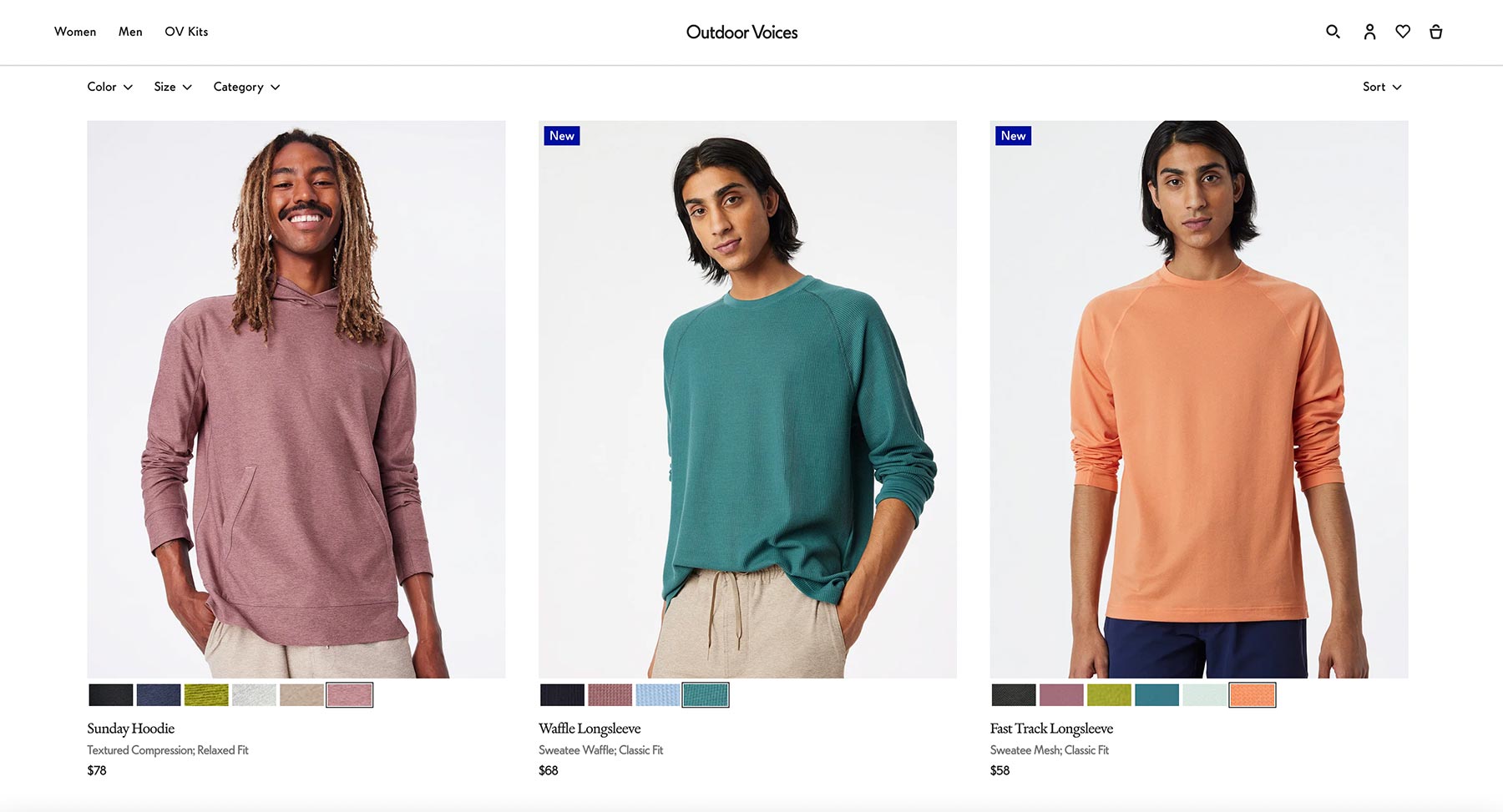
Another example is from Outdoor Voices, a popular clothing store based in the US. By including the various color patterns available as swatches you are much more likely to click into a product. This greatly aids product discovery on the listings or catalog pages.
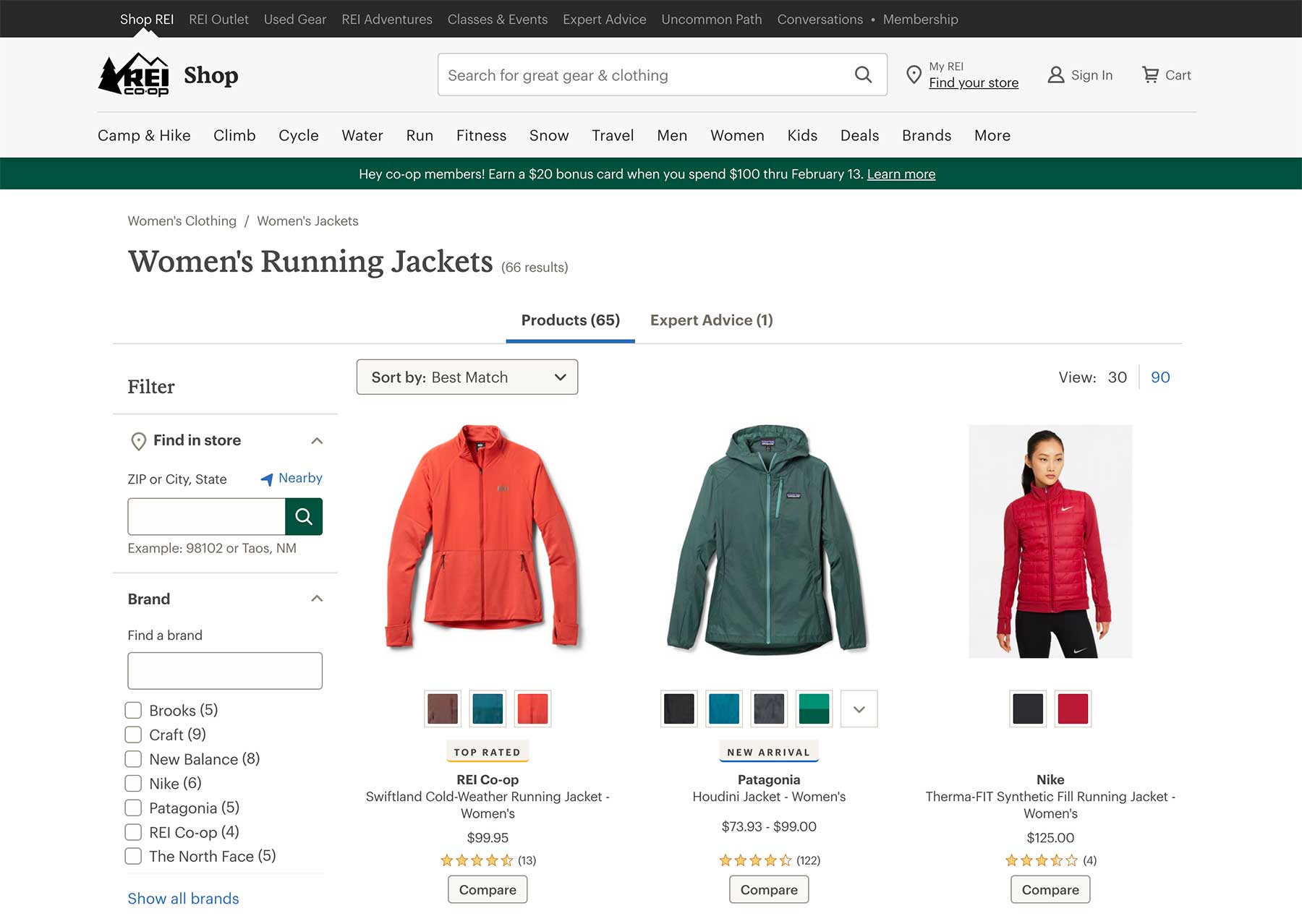
REI, the outdoor clothing store, also makes excellent use of swatches on their product listings pages. By adding solid colors, or patterns swatches within the grid, it’s easy to see what variations are available for an item.
Display swatches on Shoptimizer listings pages
We’ve seen earlier, that we can now display visual swatches on product pages. We’ve extended this CommerceKit feature to also include listings pages.
Swatches can be set to appear within the product grid and we have added an optional add to cart option to make it even quicker to purchase variable products. You don’t even need to visit the product page. This is a huge conversion win for all kinds of stores.
See the video below for a demonstration on how it works.
It was a mammoth task to build this feature. We’ve seen plenty examples of extremely slow listings pages with swatches and we wanted to avoid degradation in performance.
We’ve built Attribute Swatches on the listings pages in a light, performance-focused way. So even with swatches active on listings page, you can still pass Google’s Core Web Vitals, a key aspect of their page experience update.
By utilizing an inbuilt cache and the WooCommerce action scheduler, you get incredibly quick-loading listings pages, even on stores with thousands of variable products. We continuously battle-test each feature on stores with massive catalogs.
On mobile devices, it looks and works really well also.
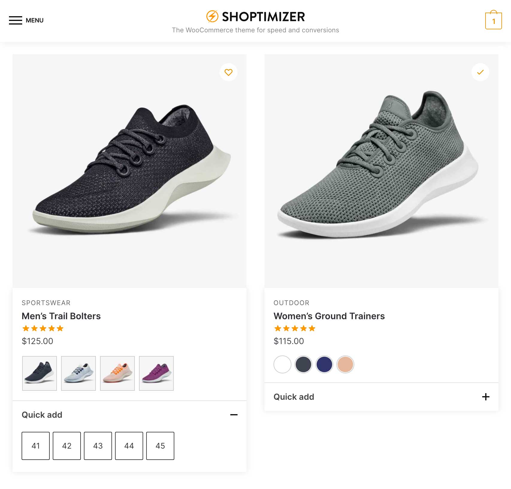
Similar to the accordion feature we discussed earlier, the expand/collapse functionality on mobile uses the <details> HTML element, ensuring that it is standards compliant, fast, and importantly, accessible.
We think it’s the most performant implementation of displaying swatches on WooCommerce listings pages. No third-party plugin comes close.
More new features and options
This is a huge Shoptimizer and CommerceKit release with dozens of extra features and tweaks. For a full list, see the changelog. Here are some of the new options we’d like to highlight.
Shoptimizer now uses the Inter font
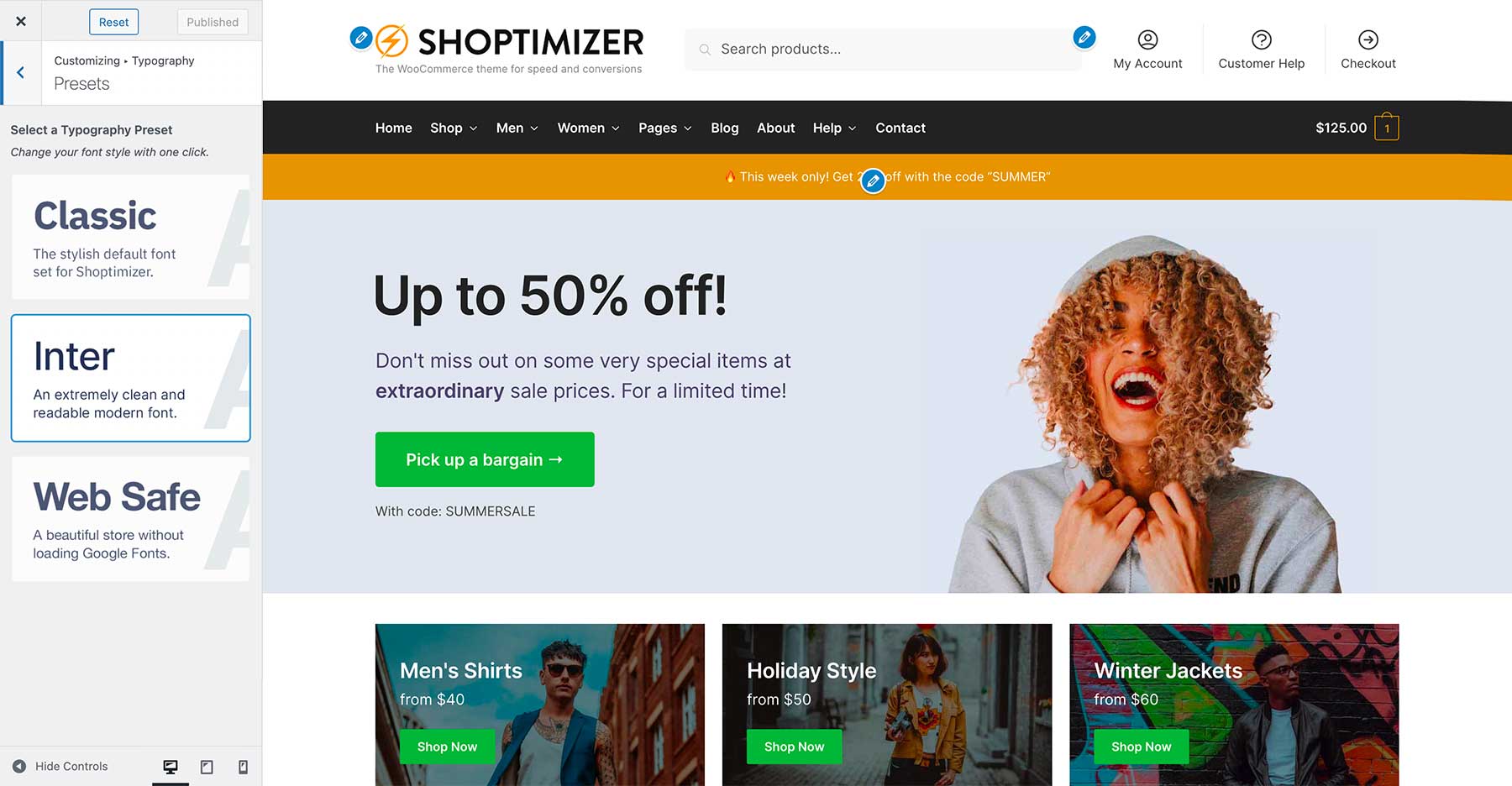
Another small change you may have noticed on the Shoptimizer demo site is that the font has changed. Previously, it used IBM Plex Sans. I’ve always been a fan of Inter since it came out, a font designed by Rasmus Andersson, with a focus on readability. It’s available in multiple weights and it reminds me of the classic Helvetica font. Clean, and highly legible.
You can switch to it within the Typography > Presets area of the customizer. Or leave the Classic look (IBM Plex Sans) active, it’s up to you.
Our demo site utilizes just two font weights, 400 and 600 to keep the number of font files loaded on each page to a minimum.
Enable the Block Editor on Product Pages
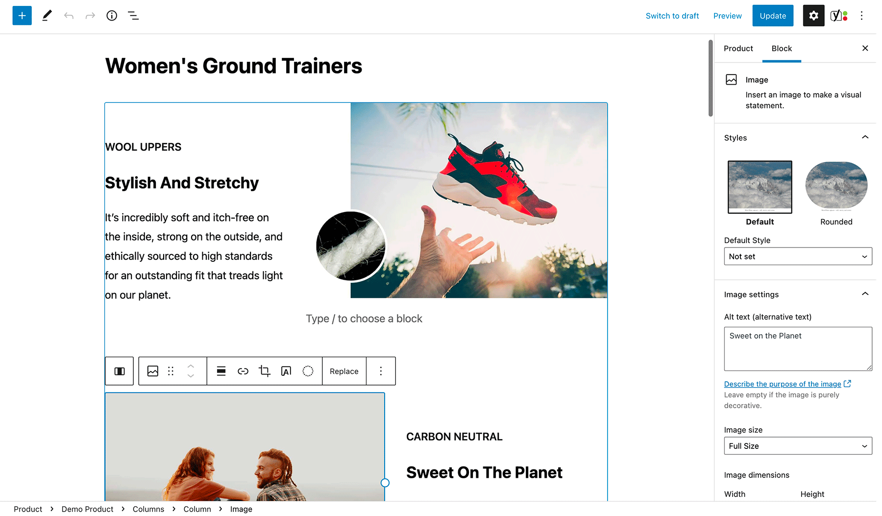
We’ve included the option of using the Block Editor (sometimes called Gutenberg) on the long description area of product pages. The Block Editor has improved substantially over the past 12 months, and we think it’s more than suitable to be used for product descriptions.
The long product description tends to include a relatively straightforward two-column grid of features, which are normally images and text. We’ve included a reusable block pattern in the demo data which allows you to get started with really quickly.
The Block Editor is also more performant than Elementor for this kind of simple layout. With fewer CSS and JS files loaded, you can squeeze an extra bit of page speed from your product pages.
Of course, if you’ve built these with Elementor and have a lot of products, then it’s best to stick with that page builder, rather than re-building these product descriptions again.
Disable features on specific products
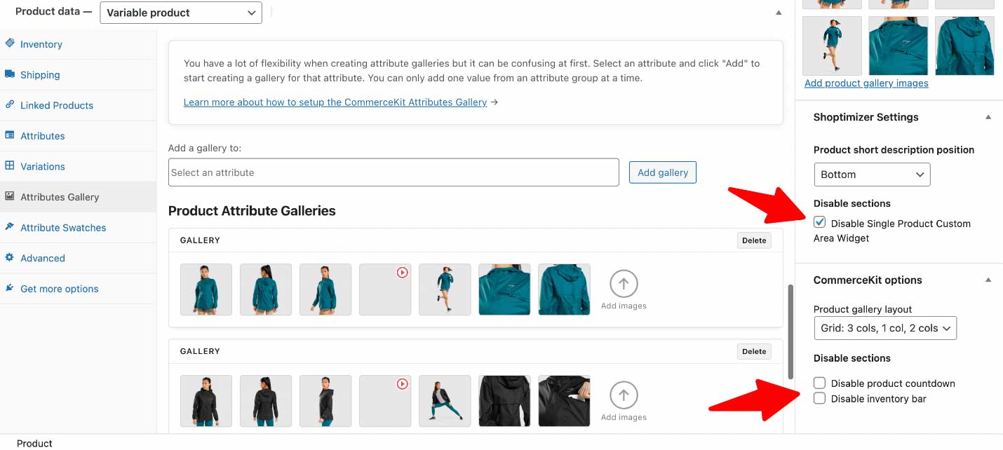
CommerceKit already includes conversion-focused features such as product countdowns and stock meters but previously there was no way to disable these on specific products. Now you can. We’ve incorporated an additional options panel when you edit the single product.
These options give you even more flexibility. So on variable products for example, you can keep the focus on the attribute selection and the add to cart button, and hide everything else.
In addition, you can also disable the Single Product Widget content for a specific product for an even cleaner look.
New sales badge and search styles
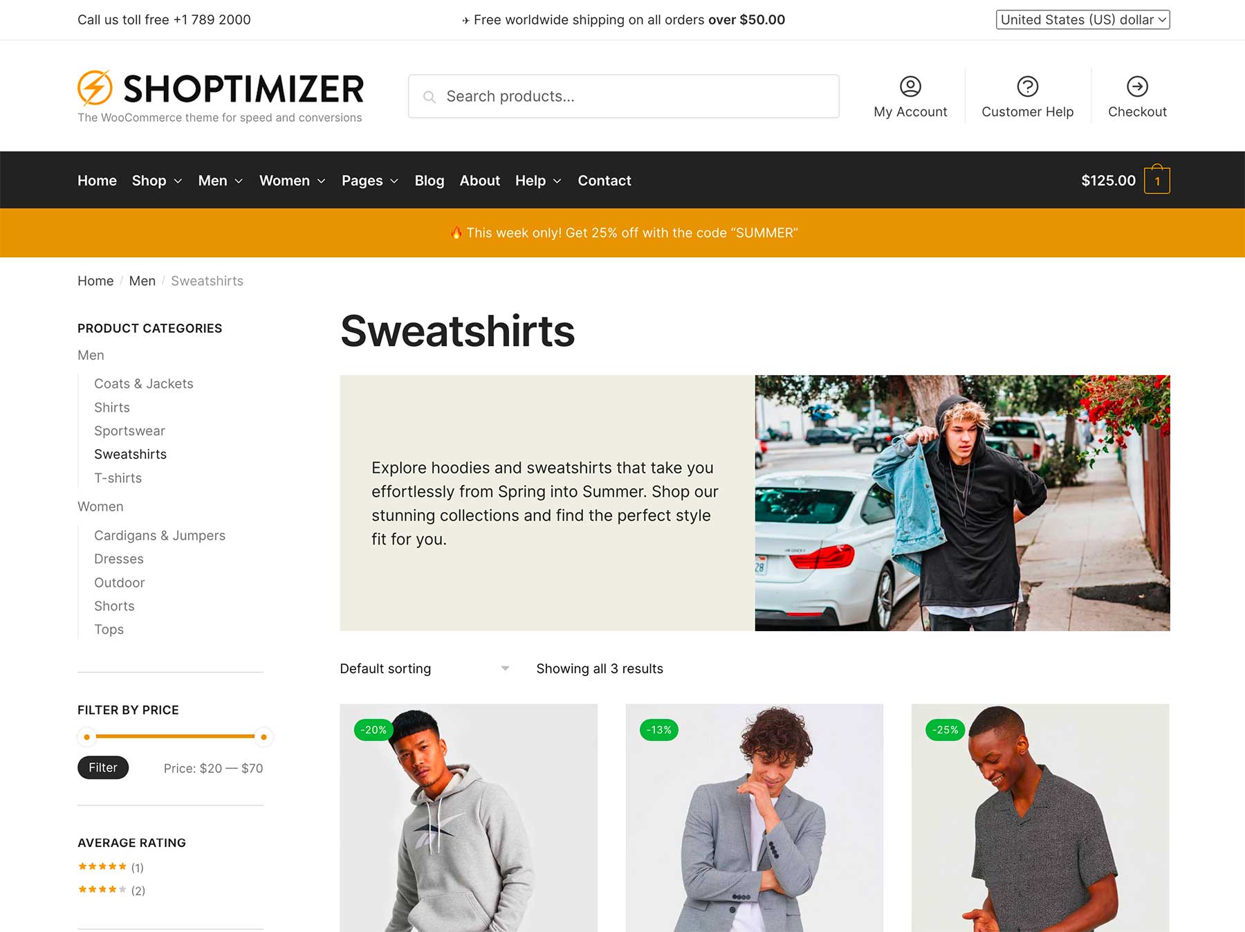
We have also included some additional styles for various elements throughout the theme. One is the look of the search bar in the header. You can now change this to Outline rather than a filled style. You’ll find that option in:
Appearance > Customize > Header and Navigation > Header > Search design
Another is the look of the sale badge which appears over products which have been discounted in price. You can now choose a more minimal look via:
Appearance > Customize > Layout > WooCommerce > Sale badge design
Create world-class product and listings pages with Shoptimizer and CommerceKit
With all of these new features you can now build world-class product and listings pages, similar in scope to the leading eCommerce examples we’ve looked at above. Want to create a product page that looks like Nike’s? Well, now you can. A listings page similar to Ikea, with add to cart functionality? It’s possible!
This is all included within Shoptimizer and our companion plugin, CommerceKit. There are no extra plugins required.
With so much value, coupled with our excellent support, it’s never been easier to launch an eCommerce store which rivals the very best in the world but at a fraction of the price.
And we’re not done yet. Expect further gallery layouts and even more product page options. Our aim is to make Shoptimizer and CommerceKit the best combination to build an outstanding eCommerce experience, with functionality and performance that you simply won’t find in any other theme.
How do I get started with the update?
Before anything, we always recommend you first back up your WooCommerce store, and perform the update on a separate staging site first. If you don’t have a staging site, most web hosts can assist in setting one up.
Next, follow the update guide for Shoptimizer, and a separate one for CommerceKit.
We’ve added a lot of additional documentation, including walk-through videos on setting up all of these features so that you can create variable products just like the Shoptimizer demo store.
Finally, our changelog includes a complete run-down of everything in the update. There’s a lot more in it, which we haven’t covered in this post. To keep informed about this update, and future ones, be sure to subscribe to our weekly eCommerce newsletter.
Let us know in the comments below what you think about all of these new features. We hope you’re excited about them as we are!


 How to Add Product Video in WooCommerce
 How to Make Your WooCommerce Product Pages Stand Out
 Extend your WooCommerce products with the Products Add-ons plugin
 Suave WooCommerce Theme Launch – plus Sample Sites
I just finished updating WP to the new maintenance release and tomorrow I’ll update the shoptimizer theme, just want to say huge congrats on the diligent work that is being done with Shoptimizer, I pester you with UX examples every once in a while and interesting information I find and always receive a proper attentive reply, a honest congrats to the team!
Thank you!
Hi Simon,
GREAT UPDATE!
Love it so much. I just can’t seem to find the accordion.
Am I missing something?
Carla
Thanks! We cover the accordion creation in our video guide and in a separate article in the docs. Note that it’s not currently supported if you use Elementor on product pages. That’s coming soon.
Seems like Gutenberg editor is now the default for product editing. How can this be disabled?
Hi JT. Via: Appearance > Customize > Layout > WooCommerce – ‘Enable block editor’
Love the update.
What do you recommend as the best host for mp4 files?
I wouldn’t like to put them on my server just because of size issues.
Cheers,
Edward
Thanks Edward! We highly compress MP4s, typically < 2MB in size, and use our own server. I would be surprised if there were storage issues unless you had thousands of videos.
True Simon,
It’s going to be something catchy for a few seconds that loops.
Congratulations on the big update!
I have found a problem with variable products.
In the list of variable products the available variations appear well, but if you use a filter these variations disappear.
On the other hand, in the product listings the variations look very large, I think the best thing is that they were smaller.
One last thing. When viewing the listings on mobile, you can no longer see the products 2 by 2. Now they only come out one by one, I think it is more functional to show the products 2 by 2 to reduce the user’s scrolling.
Thank you very much!
Hi there, if you send a message to [email protected] with your Order number and a link to an example, we can take a closer look.
Hi Simon,
the guide to set up the demo product description forgets a little step.
If you don’t have a reusable block defined yet, you get an error message about an undefined post type.
You have to first create some random reusable block so that the post type gets created/activated and then you are already on the page to upload the demo json.
In that regard, I tried the Woocommerce blocks that come with Gutenberg and they all have their own styling. Would it be a lot of trouble to ask for a guide on how to copy the Shoptimizer theme styling to the Gutenberg Woocommerce blocks?
Then I could ditch Elementor completely.
Cheers,
Edward
Hi Edward, can you pop a message to [email protected] detailing the issue – it’ll be easier for us to track it there.
Hi Edward and Simon,
Sorry to barge in. Were there any developments on this. I am very interested to use Shoptimizer without Elementor as well.
Thank you for this question.
Slim