Get a fast, conversion-focused WooCommerce theme in 2024. Switch to Shoptimizer.

Home checkout

10 Best eCommerce Checkout Page Designs to Learn From

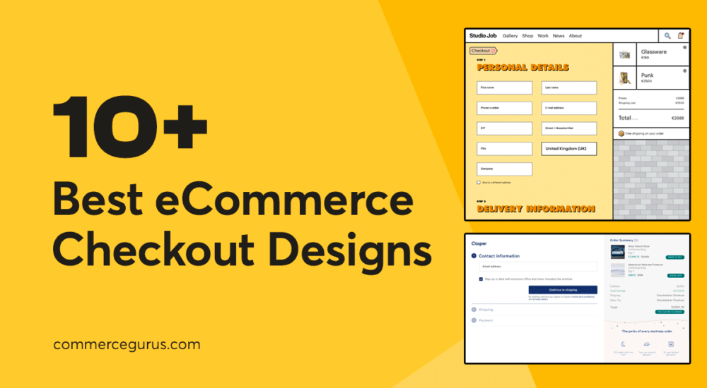
10 Best eCommerce Checkout Designs

A badly designed eCommerce checkout page could be costing your online store valuable sales and profits.

One sign that you might have a badly designed checkout page is your metrics reporting that shoppers are reaching the checkout only to leave without making a purchase.

While there are many reasons why someone might abandon their cart at the checkout page, poor design is definitely one of them.

As design covers much more than just aesthetics, including user experience, trustworthiness and credibility, ease of use, load times, and accessibility, there’s a lot that can go wrong with the design of your checkout page.

If you’re worried that this part of your store is letting down your business, this guide covering the 10 best eCommerce checkout page designs to learn from will help you determine if your checkout page could be improved, and if so, in what ways.

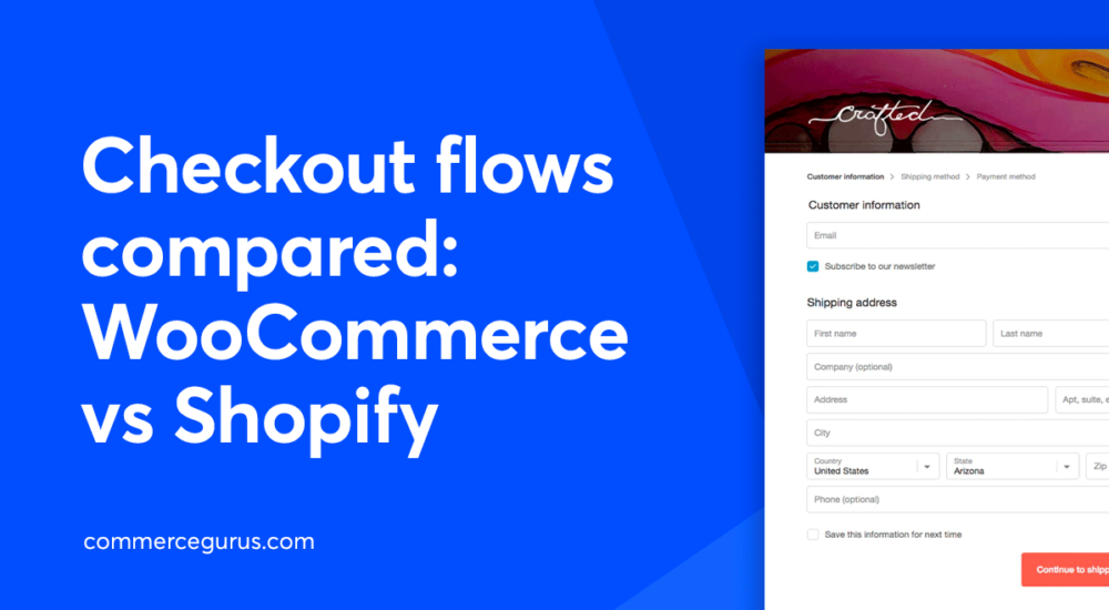
Checkout flows compared – WooCommerce vs Shopify

Checkout flows compared: WooCommerce vs Shopify

One of the main drivers you should consider when choosing an eCommerce platform is the checkout flow. The checkout flow refers to the series of steps a buyer follows to place their order and is a crucial factor in a store’s conversion rate!

According to Baymard’s research on checkout UX, the average site has an incredible 31 preventable usability issues in the checkout flow. So on most stores there is huge scope for improvements.

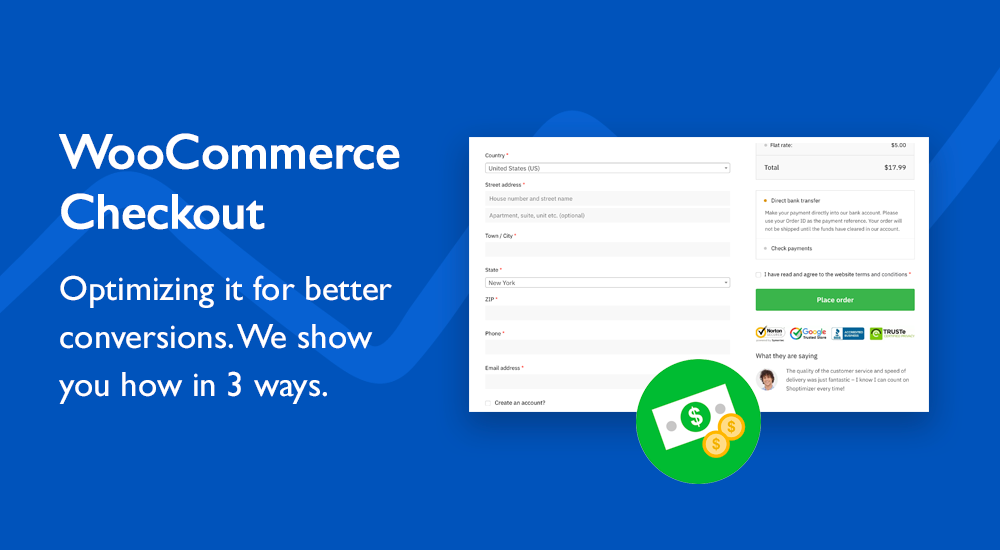
WooCommerce Checkout: Optimizing it for better conversions

Although the default WooCommerce checkout is reasonably well laid out I think more can be done to improve this crucial step for store owners. Because, really this is now the most important step of the process. You’ve done the hard work, encouraged a buyer to select a product, add it to the cart – now you need them to buy.

You don’t want your effort to be wasted and with a couple of easy tweaks you’ll be able to reduce the likelihood of this happening. I’m going to show you how to optimize your WooCommerce checkout to present the best possible experience to buyers and encourage them to complete the process. Let’s get started!

Speeding up checkout with an address autocomplete plugin

It’s vital in eCommerce to ensure a customer can quickly enter their billing details and get through the payment process with as little fuss as possible.

Address Autocomplete for WooCommerce is an intelligent yet easy-to-use extension that allows you to sync your site with Google’s Address Autocomplete API at the checkout page. This saves your customers time and effort when filling out their checkout form’s address fields.

That’s why I’m interested in WooCommerce’s address autocomplete plugin to quickly return location results as soon as you start typing.

Customizing WooCommerce Checkout Fields

Today we’re featuring a very useful plugin that allows you to customize the fields that are displayed when completing the checkout process in WooCommerce.

You may need to display extra fields such as a delivery date or indeed you might want to remove unnecessary ones just as the phone number to streamline the checkout process. Nobody wants to spend time filling out form inputs if they’re not actually required.

Success!

The discount has been applied. You will see it when you checkout.

There has been a problem

Unfortunately this discount cannot be applied to your cart.

$50
Off

Do you want a whopping $50 off Shoptimizer for WooCommerce?

Click the button below to get Shoptimizer for only $49. (Regular price: $99).
This is a special launch offer for today only.
Get it before it is gone!